Selective redesign · Mobile + Web
LinkedIn Jobs
From job search to job decision.
A conceptual redesign that helps job seekers understand whether a role is worth pursuing before they apply, with job match, a decision snapshot and their network built into every job.
Hover the screens to scroll through them.
Overview
A conceptual redesign of LinkedIn Jobs, deliberately limited to the jobs experience rather than the whole LinkedIn product.
- Role
- UI/UX Designer
- Type
- Conceptual redesign
- Scope
- LinkedIn Jobs: discover, search, evaluate, apply and track
- Platforms
- Mobile + Web
- Tools
- Figma and supporting research tools
The idea
From job search to job decision.
Research
Secondary research into the current job-search landscape, reviewing LinkedIn Jobs alongside Indeed, Glassdoor and Wellfound, and mapping the full journey stage by stage: what works, where the friction is, and the opportunity.
Journey audited
- Discover
- Search
- Results
- Evaluate
- Job details
- Network
- Apply
- Track
Key direction
Finding jobs is relatively easy. Evaluating them and deciding is where the effort goes.
UX audit
Four problems stood out, each traced from the current experience to why it matters and the opportunity it opens.
- Problem 01
Fit isn't obvious
People don't always understand straight away whether a job fits them.
- Problem 02
Scattered information
What you need to decide is spread across the experience.
- Problem 03
Network comes too late
Connections aren't tied strongly to the moment of decision.
- Problem 04
Manual comparison
Comparing several opportunities takes manual effort.
Competitive analysis
LinkedIn, Indeed, Glassdoor and Wellfound were compared on job matching, salary transparency, company information, qualification matching, network value, the application experience and tracking.
Opportunity
Connect job relevance, career context and your professional network in one decision-making experience.
Persona & JTBD
An active professional job seeker: someone who already knows how to search, and whose real cost is the time spent on roles that turn out not to fit.
Job to be done
“When I'm looking for a new job, I want to quickly identify opportunities that genuinely fit my skills, expectations and career goals, so I can confidently decide where to spend my time applying.”
The problem
Root insight
Search isn't the only problem. Decision-making is a major part of the job-search experience.
Design principles
- 01
Relevance first
Show why a job matches.
- 02
Decide before applying
Surface the important information before asking anyone to apply.
- 03
Network as an advantage
Make connections useful while evaluating a job.
- 04
Less cognitive load
Bring scattered decision information together.
IA & user flow
The architecture stays inside the Jobs scope, and one flow is the backbone of both the mobile and web designs.
Jobs
- Discover
- Search
- Results
- Job details
- Match
- Network
- Apply
- Track
User flow
- Jobs home
- Search
- Results
- Evaluate match
- Job details
- Network & hiring team
- Apply
- Track application
Key UX concepts
What was actually redesigned, and the question each part answers.
Job Match
How well does this role fit me, and what's missing?
Decision Snapshot
Salary, experience, skills, work mode and company context in one place.
Network Advantage
Relevant connections and the hiring team, right on the job.
Application Tracker
Clear progress after you apply.
Mobile UI
The final mobile screens in journey order: discover, search, evaluate, apply and track. Click any screen to see it larger.
Discover & search
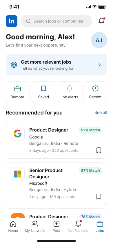
Jobs home
Recommended jobs, each with a match score.
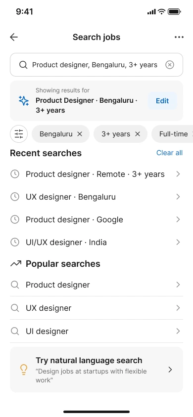
Search
Recent and popular searches, plus natural-language search.
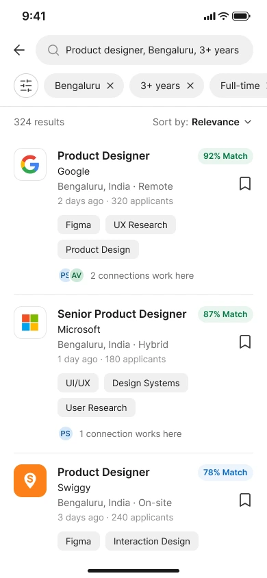
Search results
Match percentage and connections on every result.
Evaluate
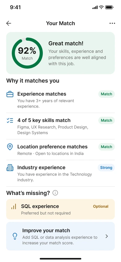
Your match
Why it fits, skills matched and what's missing.
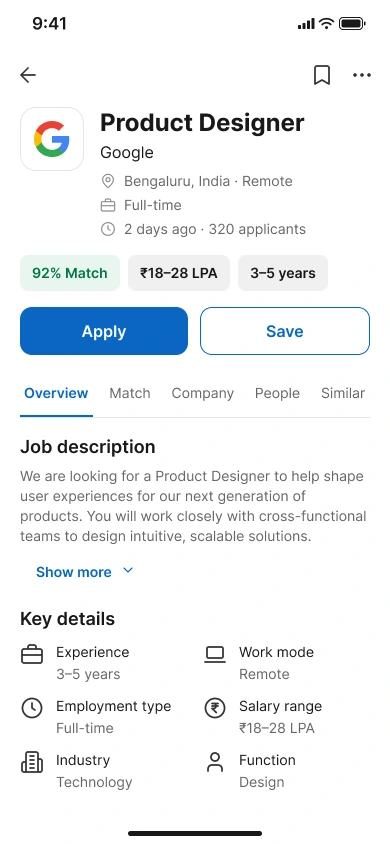
Job details
Match, salary and experience before the description.
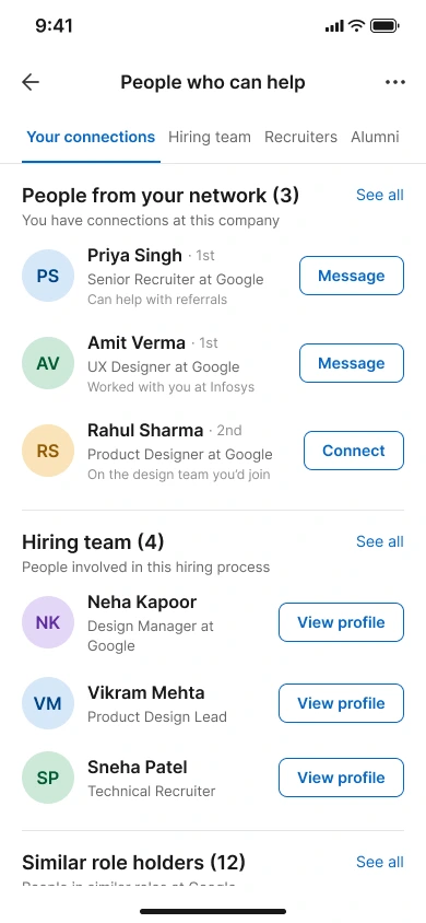
People who can help
Connections, hiring team, recruiters and alumni.
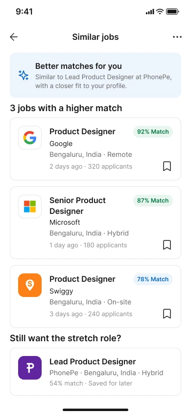
Similar jobs
Better matches, without losing the role you were looking at.
Apply
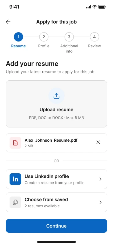
Add resume
Upload, use your LinkedIn profile or pick a saved one.
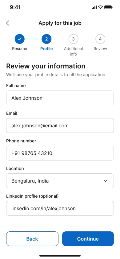
Your information
Pre-filled from your profile.
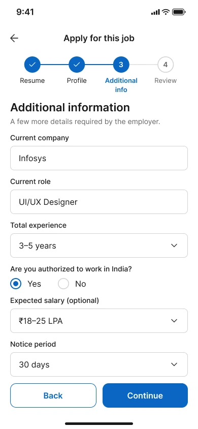
Additional info
Only what this employer asks for.
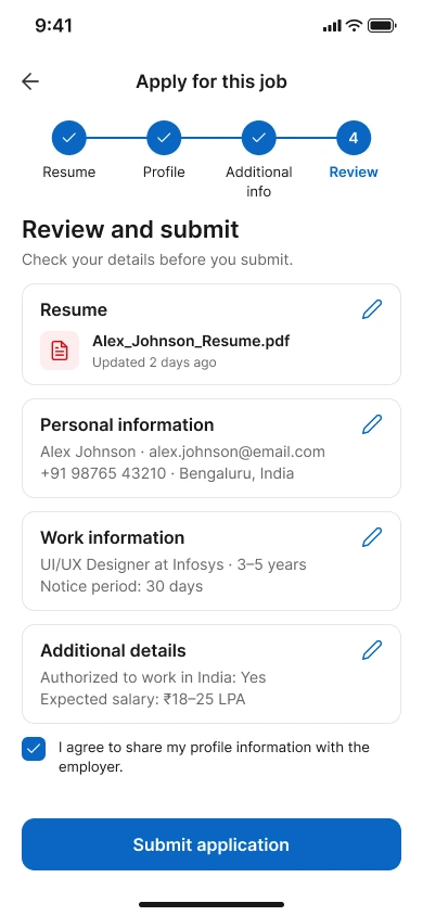
Review & submit
Everything editable before you submit.
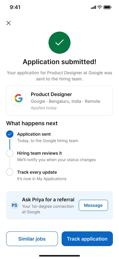
Submitted
What happens next, and a nudge to ask for a referral.
Track
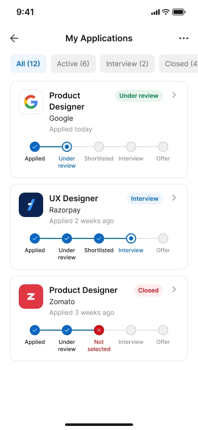
My applications
Every application and its stage.
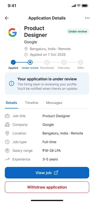
Application details
Progress, timeline and messages.
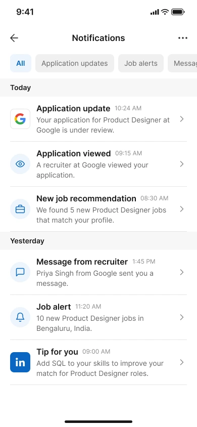
Notifications
Application updates, recruiter views and job alerts.
Edge states
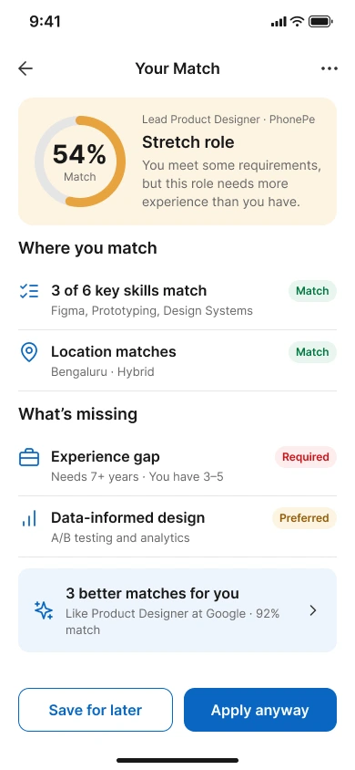
Stretch role
Explains the gap honestly and suggests better matches.
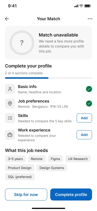
Match unavailable
Asks for missing profile details instead of guessing.
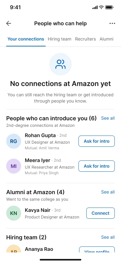
No connections yet
Still shows the hiring team and possible introductions.
Web UI
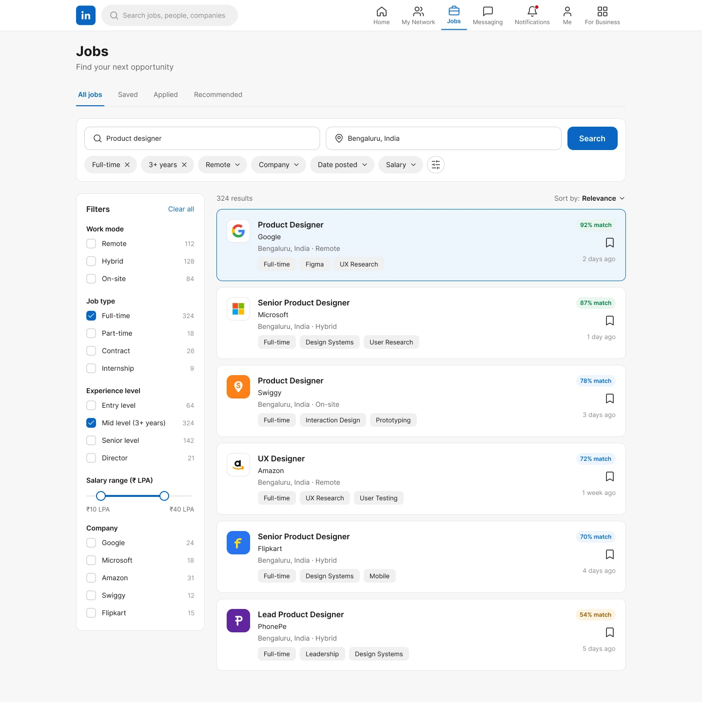
The same journey on desktop, where the extra space carries a bigger information architecture: search alongside filters, and match, skills and people next to the job. LinkedIn's own visual language, with no invented branding. Hover a screen to scroll it, click to see it larger.
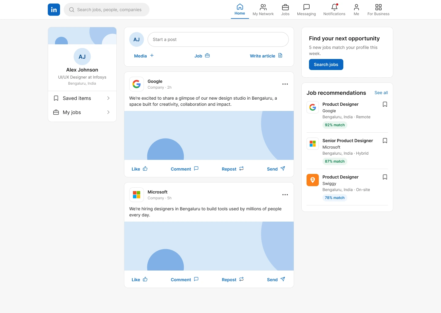
Home feed
Job recommendations with match scores in the feed.
Job search
Filters beside results, with match and skills on every card.
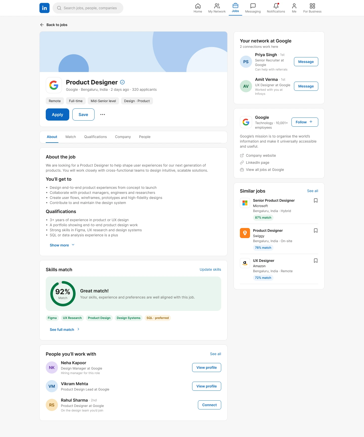
Job details
Match summary, skills match and people you know beside the description.
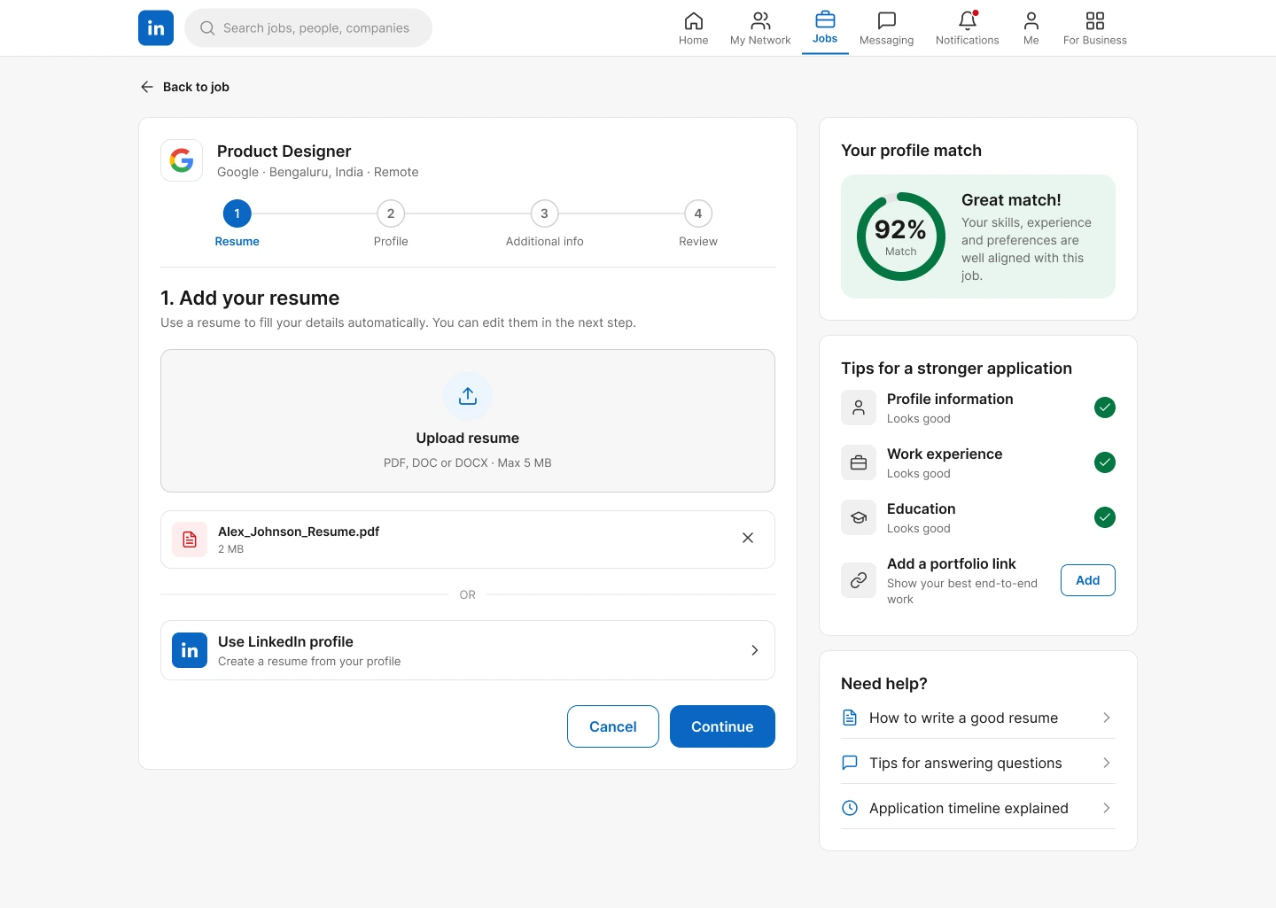
Apply · Resume
A stepper, with your profile match and tips alongside.
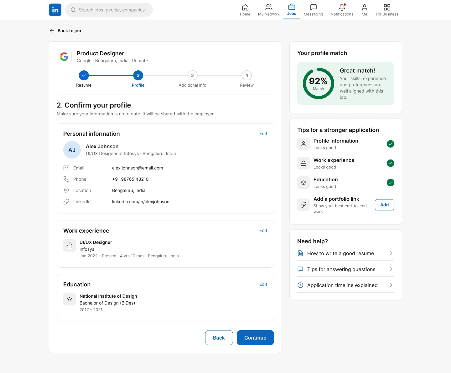
Apply · Profile
Confirm the details pulled from your profile.
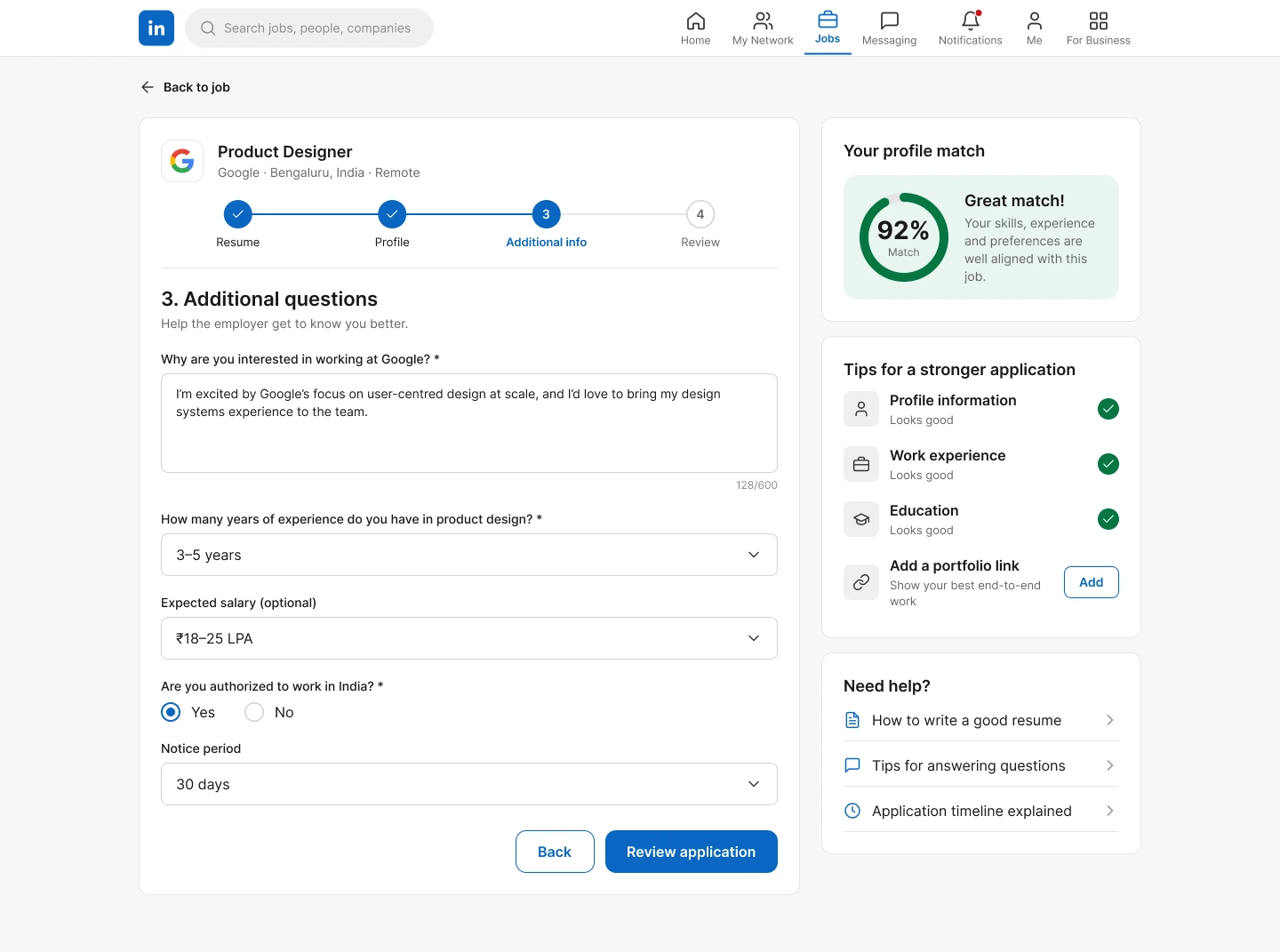
Apply · Questions
The employer's questions, nothing more.
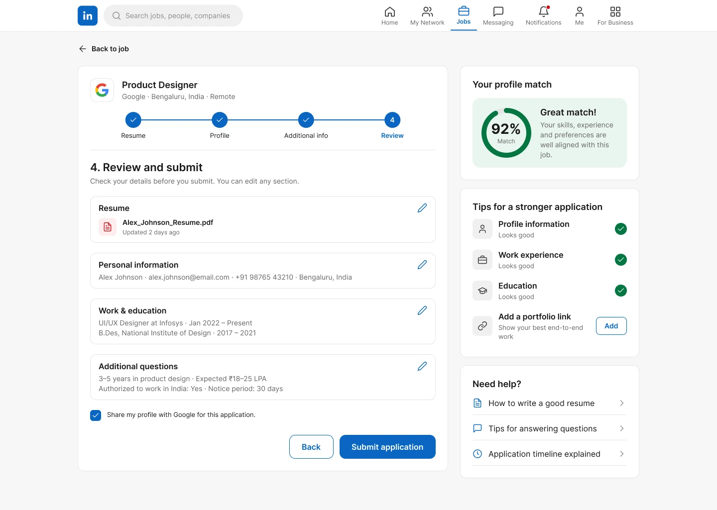
Apply · Review
One last look before submitting.
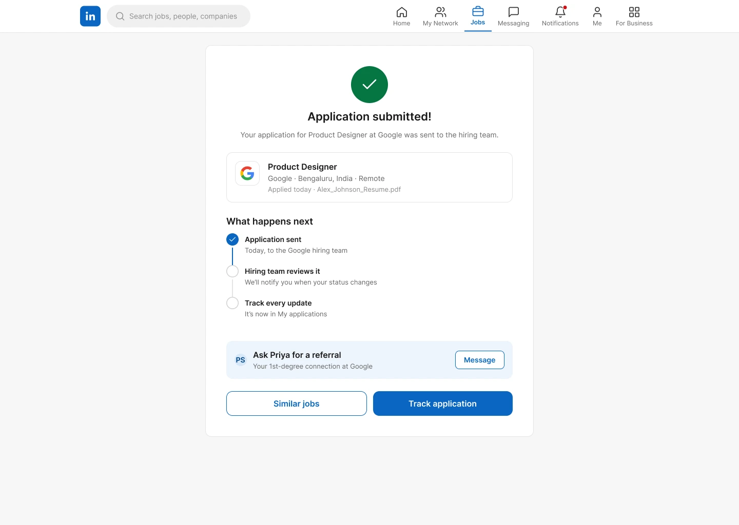
Submitted
Next steps and a referral prompt.
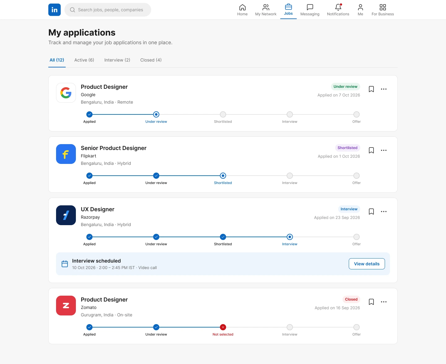
My applications
Progress for every application, including interviews.
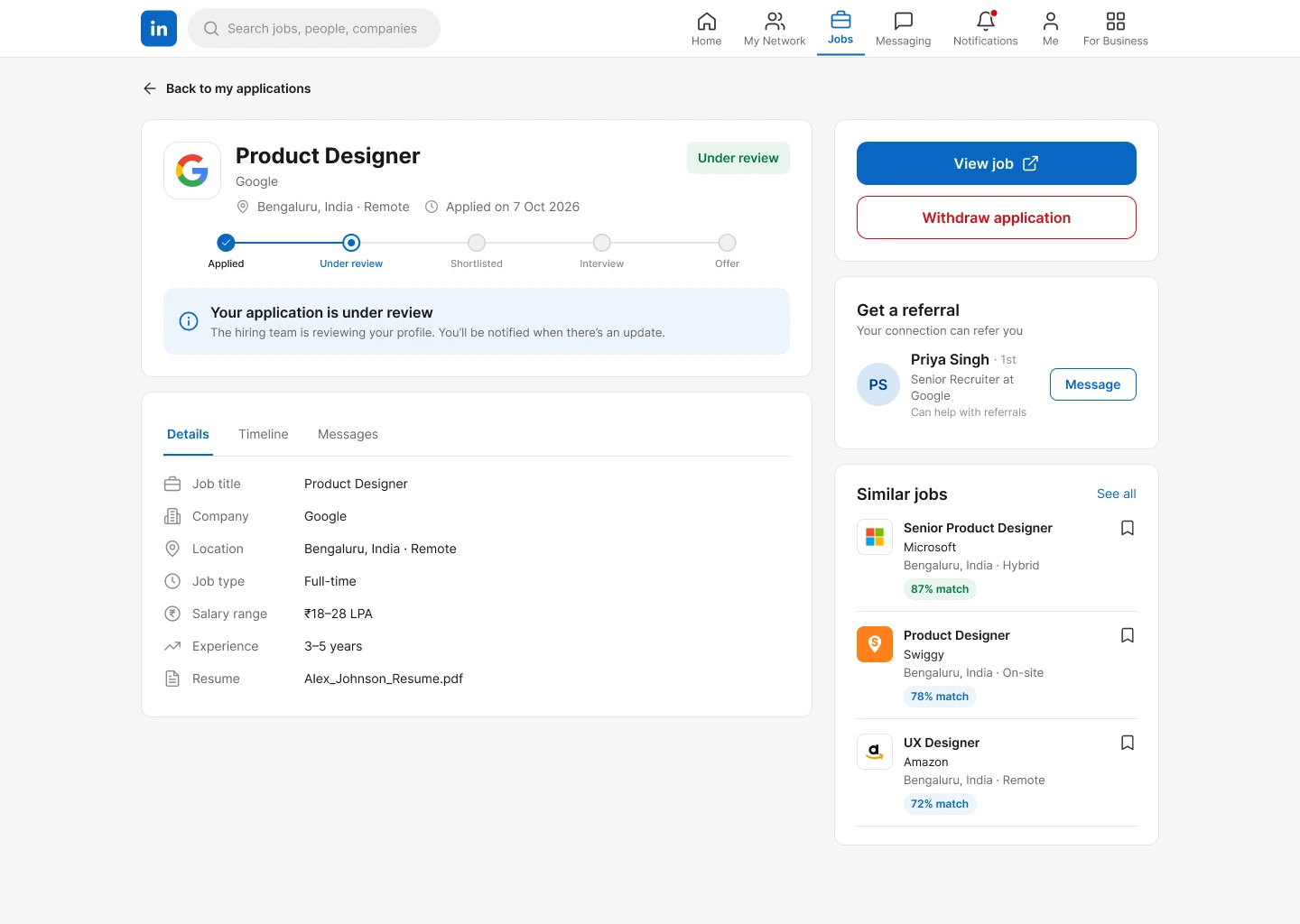
Application details
Status, timeline and similar jobs for one application.
Before → after
Before
- Job relevance needs interpreting.
- Decision information is scattered.
- Your network is secondary.
- Apply is the main endpoint.
After
- A match summary is surfaced upfront.
- A decision snapshot brings the key factors together.
- Your network is part of the job decision.
- Evaluate → decide → apply → track.
Key decisions
- Why
A match score?
People need relevance before investing their time.
- Why
Network on the job page?
A relevant connection can change whether a role is worth pursuing.
- Why
An application tracker?
The experience should carry on after you click Apply.
Validation plan
This is a conceptual redesign. It hasn't been validated with live users, so no results are claimed. Here's how it would be tested.
- Task completion across the core path: search → match → job details → network → apply → track.
- Match comprehension: do people understand why a job fits?
- Job comparison: is choosing between roles easier?
- Application confidence.
- Tracker usability.
Outcome & reflection
The redesign strengthens the decision-making layer of LinkedIn Jobs, without claiming any measured business impact.
- Discover faster
- Decide with confidence
- Apply with clarity
What I learned
- Search UX isn't only about finding results.
- Decision-making is a major part of the job-search experience.
- Strong redesigns keep a product's useful strengths while solving meaningful friction.
- Good UX isn't making an interface look newer; it's improving how people make decisions.