Daily UI #002 · Mobile app
Credit Card Checkout
Luma Store
A checkout that feels familiar, secure and effortless. Review your order and pay with confidence.
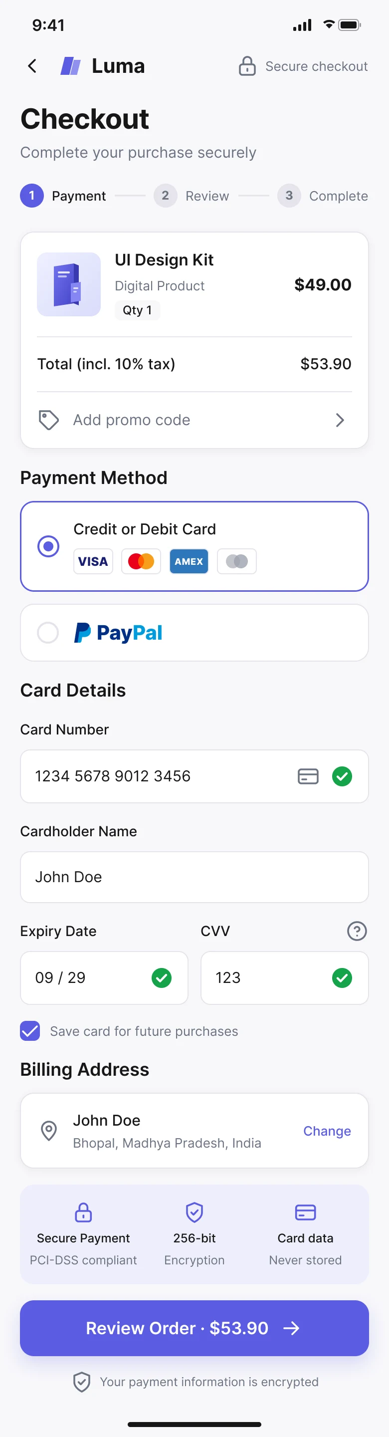
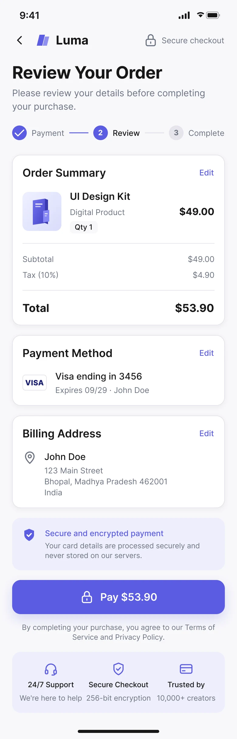
Hover the screens to scroll through them.
The brief
Create a simple, trustworthy checkout that lets people pay confidently, with minimal friction.
Daily UI #002
“Design a credit card checkout form or page. Don't forget the important elements such as the numbers, dates, security numbers, etc.”
Concept
Luma is a modern store selling premium creative products. A customer has picked a UI Design Kit and is ready to pay: they review the order, choose a payment method, enter card details and confirm the final amount.
- Platform
- Mobile app, designed at 390 × 844.
- Why mobile
- Touch-friendly controls, a concise hierarchy, readable fields and one clear payment action.
Core user goal
“I want to pay quickly and know exactly what I'm being charged.”
The problem
Checkout is a high-intent but sensitive moment. People abandon when forms are complicated, totals are unclear, security feels uncertain or errors are hard to recover from.
Target user
- Persona
- Arjun, 28 · Product Designer
- Goal
- Complete an online purchase quickly and confidently.
- Needs
- A clear total, familiar card fields, secure payment, easy recovery.
- Frustrations
- Unexpected fees, long forms, unclear errors, failed payments.
UX goals
- Cut unnecessary fields and decisions.
- Keep the total price obvious.
- Use familiar payment patterns.
- Validate details before submission.
- Offer subtle security reassurance.
- Communicate processing, success and failure clearly.
Information architecture
User flow
- Product
- Cart
- Checkout
- Review order
- Payment method
- Card details
- Validate
- Pay
- Processing
- Success or failed
Wireframes
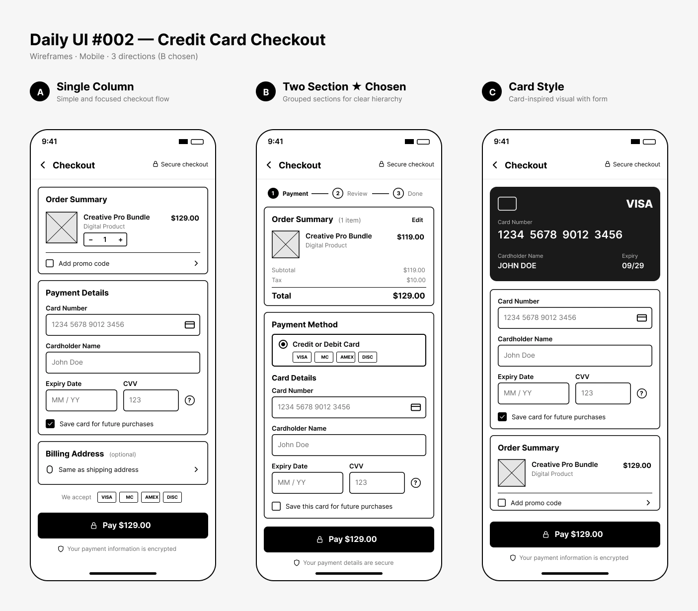
Three mobile directions explored before any visual styling.
Payment form
Familiar fields in a familiar order, each formatted and validated as it's filled.
- Card number
- Readable, grouped formatting.
- Cardholder
- A clear, visible label.
- Expiry
- MM / YY.
- CVV
- A security field with contextual help.
- Billing
- Kept separate from the payment credentials.
Design system
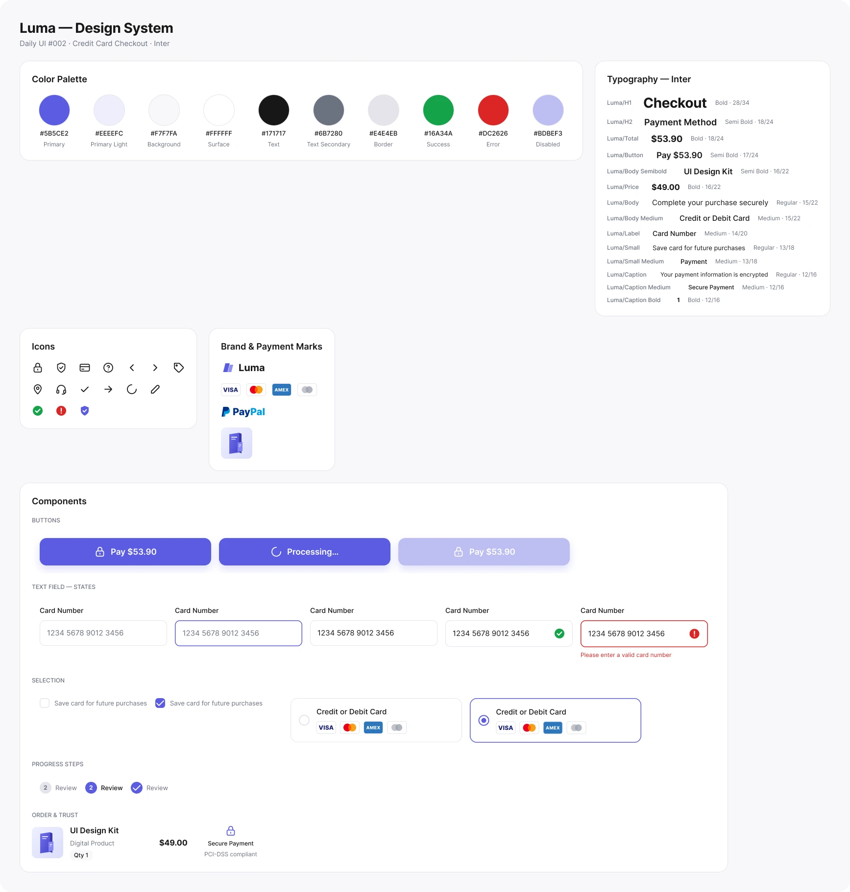
Modern, premium, calm and trustworthy. Inter with a strong hierarchy, generous spacing, rounded controls and restrained shadows.
Final UI
Order summary, payment method, familiar card fields, billing, security reassurance and an explicit payment button: premium but restrained, so usability stays first. Hover a screen to scroll it.
Payment
Order, payment method, validated card fields and billing.
Review
Everything confirmed in one place before “Pay $53.90”.
Trust & security
Subtle cues like “Secure checkout”, encryption messaging and short reassurance that card details are processed securely. Less uncertainty, without the clutter.
Interaction states
Responsive & accessible
Mobile first. On larger screens the same structure expands into payment and order-summary columns without changing the hierarchy.
Treated as core requirements
- Visible labels and sufficient contrast.
- A logical focus order.
- Descriptive error messages.
- Comfortable touch targets.
- A clear payment call to action.
Key decisions
- 01
Mobile first
For focused, one-handed interaction.
- 02
Clear total
So there's no uncertainty about the charge.
- 03
Amount in the CTA
An explicit action, not “Continue”.
- 04
Familiar fields
Nothing new to learn at the payment step.
- 05
Inline validation
Prevents avoidable payment failures.
- 06
Subtle security
Builds trust without clutter.
- 07
Recovery-first errors
Keeps people moving when something fails.
Reflection
Success means people understand the total, find the payment fields, enter details without confusion, recognise valid and invalid input, understand the payment status and recover from common errors.
The main learning: checkout design is about reducing uncertainty. Clear totals, familiar patterns, useful validation, transparent states and a confident call to action make paying feel safer and easier.
The full story
Read the full case study
The complete write-up: brief, user, flow, wireframes, design system, states and reflection.