Daily UI #003 · Web
Landing Page
FlowAI
Automate your work with AI. Describe what you need, and FlowAI builds the workflow.
Hover the screens to scroll through them.
The brief
A landing page has a few seconds to answer three questions. Everything on this one is built around them.
Daily UI #003
“Design a landing page for a book, album, mobile app, SaaS product or another concept, considering headlines, CTAs, typography and clarity.”
- 01
What is this?
Understood from the hero alone.
- 02
Why should I care?
A clear value proposition, backed by proof.
- 03
What do I do next?
One primary action, always in reach.
Concept
FlowAI is an AI-powered workflow automation SaaS. People describe what they want to automate in plain language, and FlowAI turns it into a working workflow.
Example request
“When I receive a new order, add it to my CRM and send a confirmation email.”
- Platform
- Web, desktop-first and responsive.
- Why web
- Room for navigation, a strong hero, a product visual, social proof and deeper sections, while staying adaptable to mobile.
Target user
- Persona
- Neha, 29 · Marketing Manager
- Goal
- Automate repetitive work without depending on technical teams.
- Pain points
- Too many tools, repetitive tasks, complicated automation platforms, limited technical knowledge.
The problem
Visitors leave SaaS landing pages when they can't quickly tell what the product is, who it's for, why it matters or what to do next.
Goals
- Explain the product within seconds.
- Communicate a strong value proposition.
- Build trust with integrations, metrics and testimonials.
- Show how the product works.
- Keep one primary conversion goal visible.
Conversion strategy
- Primary CTA
- Start Free
- Secondary CTA
- See Demo
- Trust cue
- No credit card required.
Information architecture
User journey
Progressive information: the hero gives enough context to understand the product, and each section below answers a more detailed question.
- Discover FlowAI
- Understand the promise
- See product proof
- Learn how it works
- Explore integrations
- Read social proof
- Start Free
Wireframes
Three desktop directions at 1440.
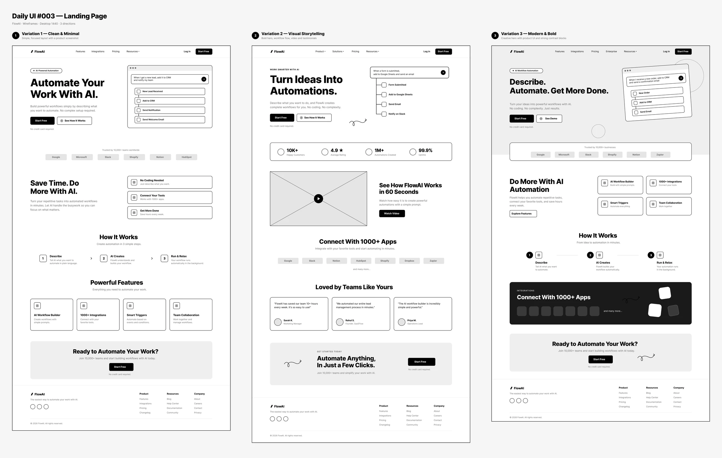
Hero strategy
The headline follows a progression: what you put in, the automation, then the outcome. The workflow-builder visual proves the claim instead of relying on abstract AI imagery.
Headline
Describe. Automate. Get More Done.
- Supporting copy
- Turn your ideas into powerful workflows with AI. No coding. No complexity. Just results.
- Primary CTA
- Start Free
- Secondary CTA
- See Demo
- Product visual
- A natural-language request turning into connected automation steps.
Design system
Modern SaaS, AI, clean and premium: Inter with large bold headings, readable body text, rounded cards, soft gradients and generous whitespace.
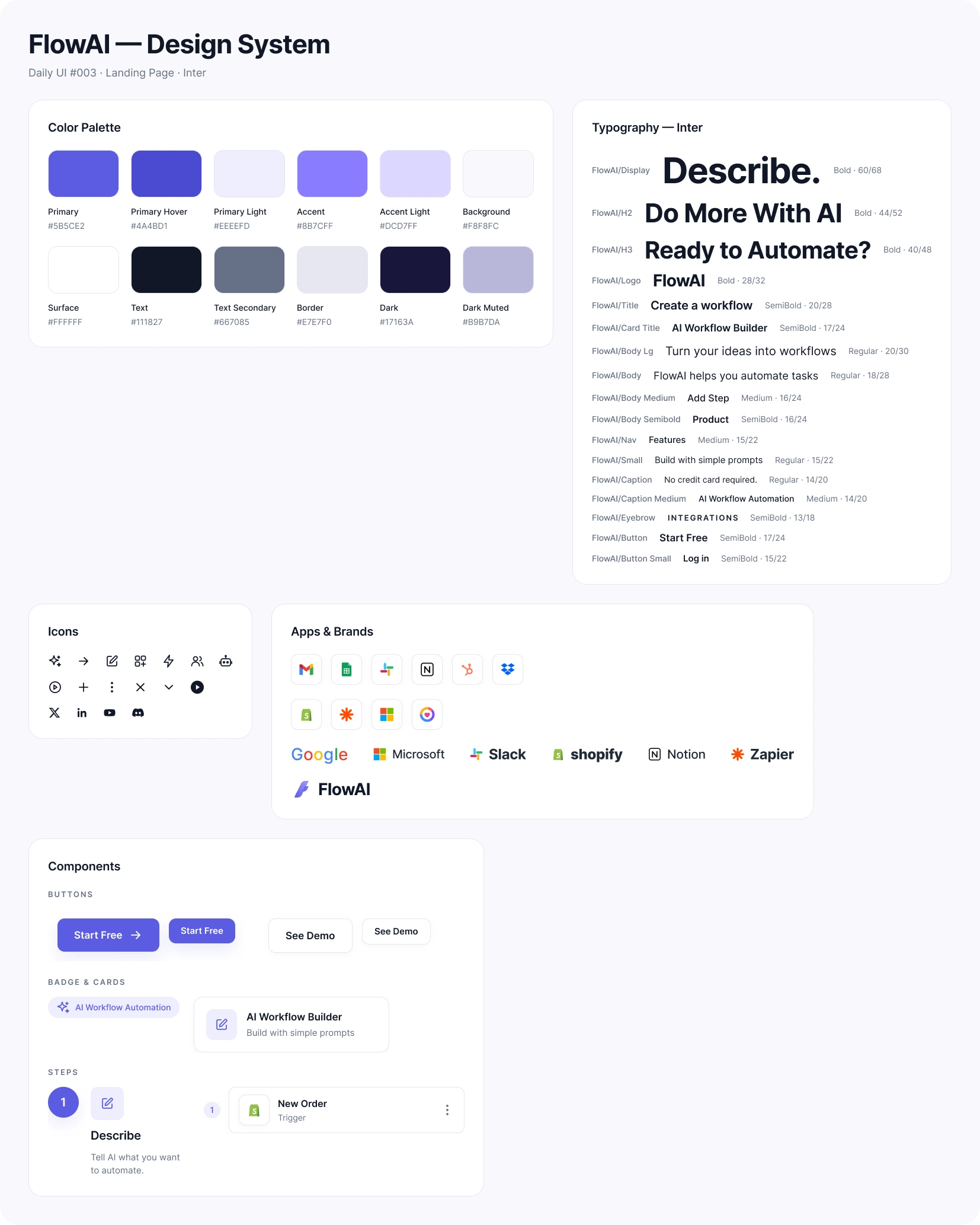
Final UI
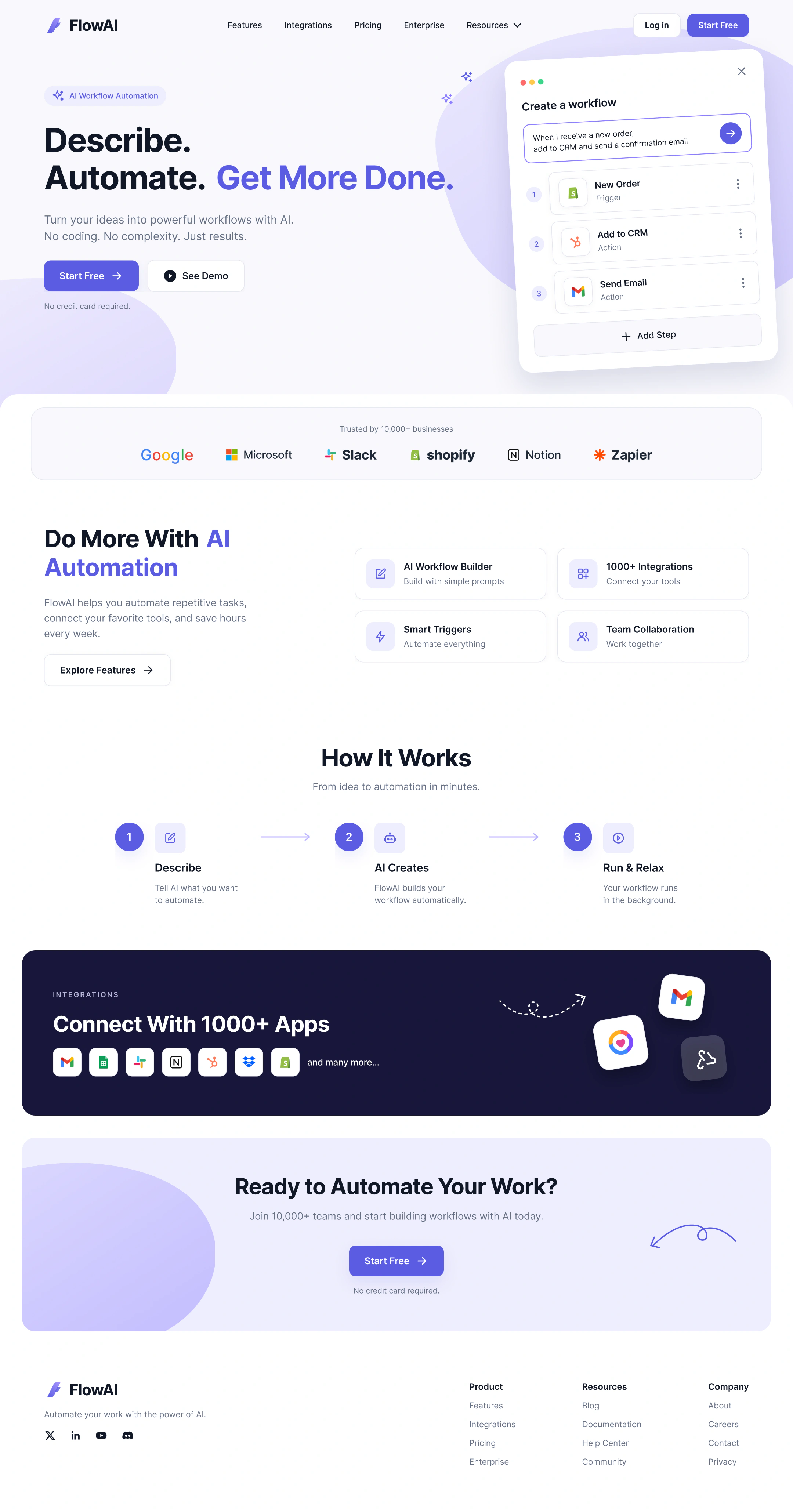
Hero, product visual, trust bar, features, the three-step process, integrations, final CTA and footer. The purple gives it an AI/SaaS personality without overpowering the message. Hover to scroll the whole page.
FlowAI landing page
Desktop at 1440, from the hero down to the footer.
Features & how it works
Outcome-focused features instead of technical jargon, and a three-step process that makes automation feel simple.
How it works
- 1
Describe
Tell FlowAI what you want to automate.
- 2
AI creates
FlowAI understands the request and builds the workflow.
- 3
Run & relax
The workflow runs automatically in the background.
Features
AI Workflow Builder
Build with simple prompts.
1000+ Integrations
Connect the tools you already use.
Smart Triggers
Automate based on events and conditions.
Team Collaboration
Work on workflows together.
Trust & conversion
Integrations, customer counts, ratings, automation volume, uptime and testimonials come after the visitor understands the product, reinforcing the claim instead of explaining it from scratch.
Responsive & accessible
On smaller screens the two-column hero stacks with headline and CTA first, feature cards collapse into a simpler grid, and the navigation becomes a menu, keeping the same hierarchy.
Accessibility
- Strong text contrast and a logical heading hierarchy.
- Meaningful button labels.
- Accessible alternatives for visuals and video.
- Status never communicated by colour alone.
- Comfortable touch targets.
Key decisions
- 01
Clarity first
Clarity before decoration.
- 02
Product-led hero
A real workflow visual, not generic AI artwork.
- 03
One primary CTA
Less decision fatigue.
- 04
Progressive disclosure
Detail grows as visitors scroll.
- 05
Social proof
Reduces uncertainty before the ask.
- 06
Outcome-focused
Features in plain language, not jargon.
- 07
Same hierarchy everywhere
A responsive structure across devices.
Reflection
Success means that within a few seconds visitors understand what FlowAI is, the problem it solves, who it's for, why it's useful and what to do next, with the rest of the page providing the evidence for that decision.
The key learning: landing-page design is mostly about communication and conversion. Every section should answer a question, remove uncertainty, demonstrate value or move the visitor closer to the primary action.
The full story
Read the full case study
The complete write-up: brief, user, flow, wireframes, design system, states and reflection.