Daily UI #008 · Mobile app
Music Player
Muse
One music player, designed for the phone, the wrist and the dashboard.
Hover the screens to scroll through them.
The brief
Design a music player that feels cinematic and expressive, while keeping the controls people use most effortless to reach.
Design principle
“The interface should support the music, not compete with it.”
Concept
Muse is a concept listening and discovery app focused on independent artists. Now Playing is the primary screen, supported by queue, lyrics, discovery and track actions, and the same player carries over to a smartwatch and a car dashboard.
- Platform
- Mobile app at 390 × 844, plus smartwatch and car dashboard.
- Direction
- Immersive and modern: artwork-led, dark and atmospheric.
- Scope
- A concept. Research and usability outcomes are proposed, not claimed.
The problem
Album art creates atmosphere, but people still need to identify the track, check progress, skip songs and reach secondary features, often one-handed and while doing something else.
Design challenges
- A clear hierarchy between artwork, track details, progress and controls.
- A primary playback action that's easy to recognise and reach.
- Secondary actions available without letting them dominate.
- Paused, buffering, queue-open and track-change states.
- Readable text over varied album artwork and dynamic backgrounds.
Target user
- Proto-persona
- Aarav, 24 · Music explorer
- Context
- Listens while commuting, working, studying and relaxing.
- Needs
- Clear playback, quick track changes, visible progress, easy liking, simple queue access.
- Frustrations
- Crowded controls, unclear icons, tiny touch targets, hard-to-read text over artwork.
- Situation
- Often outdoors, one-handed or distracted.
Primary user goal
“I want to enjoy music and control playback quickly without hunting for the controls.”
UX goals
Priority model
Must have
- Track identity
- Progress
- Play/pause
- Previous and next
Should, then could have
- Like, shuffle, repeat, queue, lyrics
- Download, share, device output
- Artist and album shortcuts
Information architecture
Organised around the current track. Secondary destinations open without interrupting listening, and coming back never resets the track or its position.
Primary flow
- Open Muse
- Choose a track
- Now Playing
- Control playback
- Lyrics, queue or like
- Keep listening
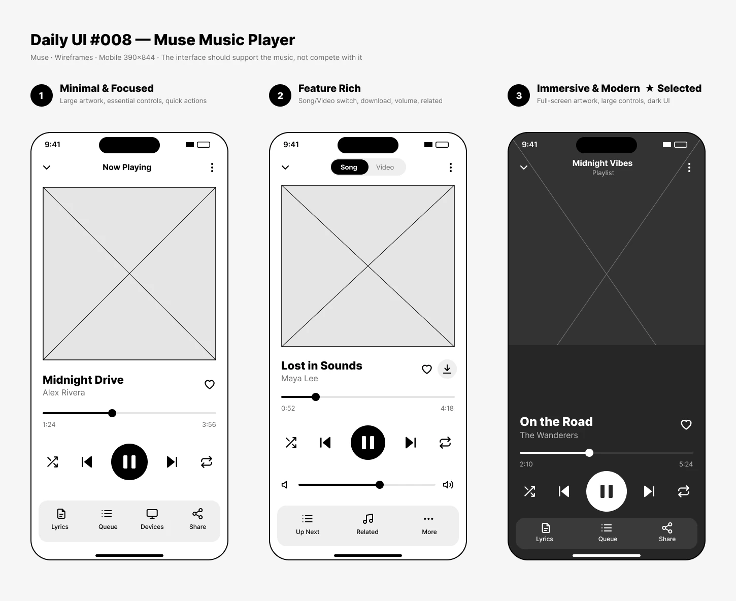
Wireframes
Three structural directions in black and white, before any visual design.
Design system
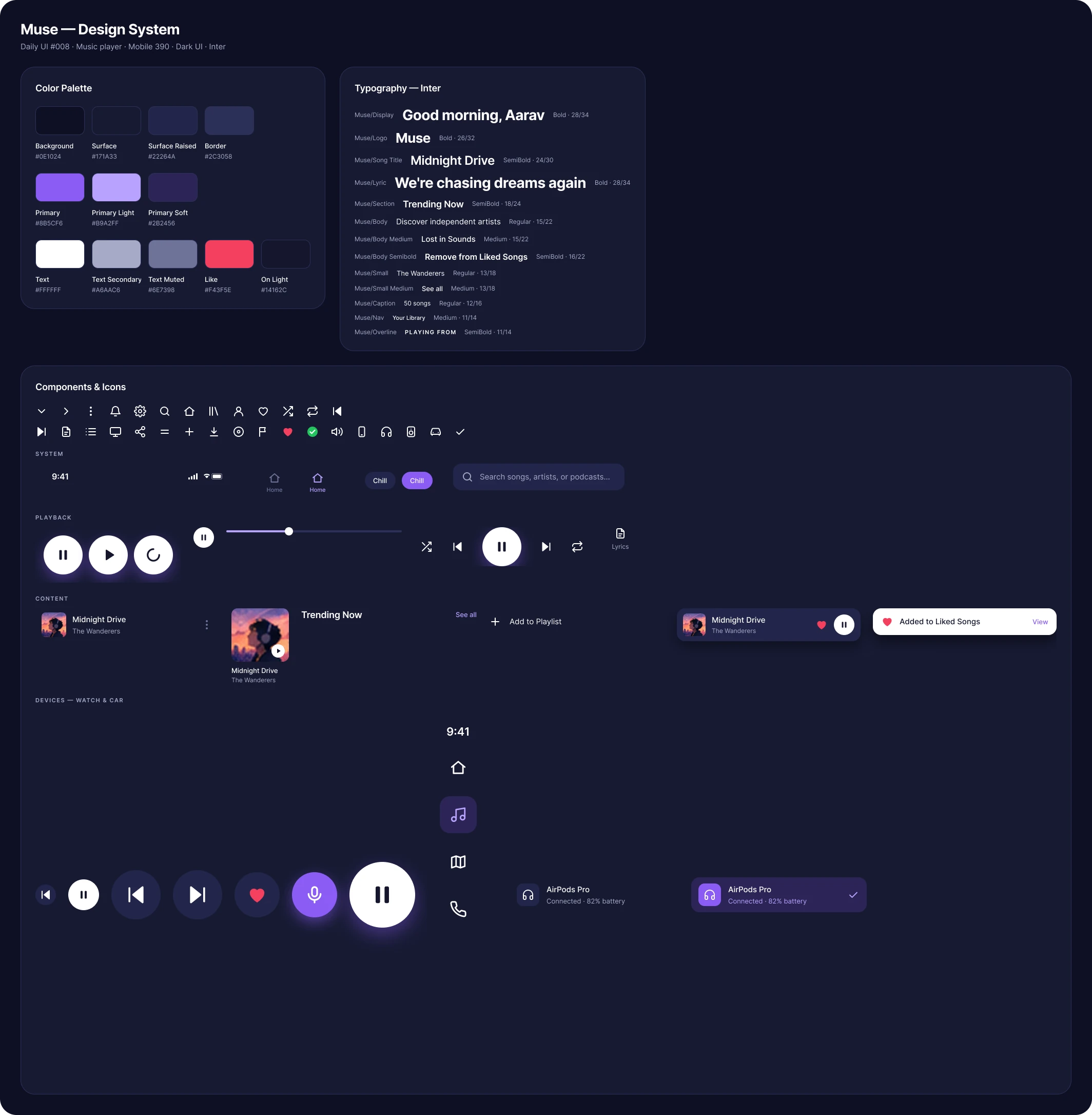
A dark navy canvas with purple accents and cinematic artwork, atmospheric without losing readable text and controls.
- Background#0B1020
- Surface#171E32
- Primary accent#8B6CFF
- Highlight#F5F3FF
- Secondary text#B6BED3
- Like accent#FF6B9A
Type, spacing & artwork
- Inter, with a large song title, medium-weight artist and small timestamps.
- An 8, 12, 16, 24, 32 px spacing scale groups related controls.
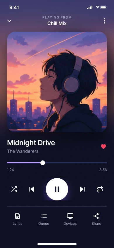
- Play/pause stays dominant; secondary icons are quieter.
- Artwork drives subtle ambient gradients, but text always sits on contrast-safe surfaces.
Final UI
Home → Now Playing → Queue → Lyrics → More options, plus choosing where to listen.
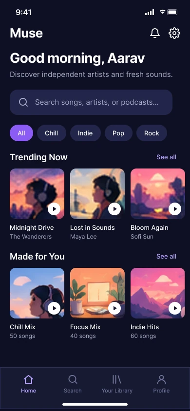
Home
Discovery, mixes and a way back into what's playing.
Now Playing
Artwork, track identity, progress and a dominant play/pause.
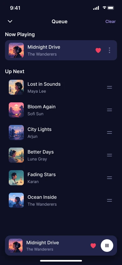
Queue
What plays next, with the current track still identifiable.
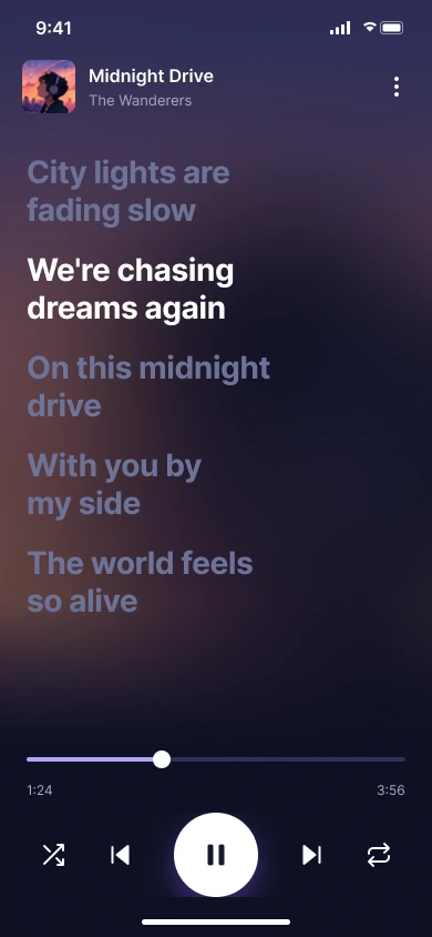
Lyrics
Follows the song, with the current line highlighted.
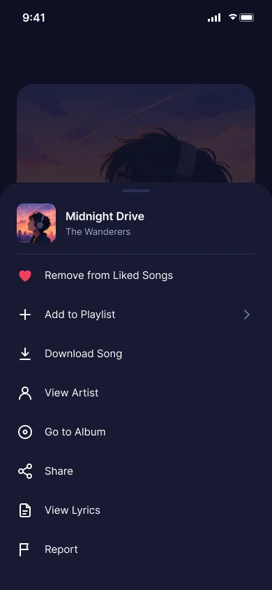
More options
Less frequent actions, kept out of the main hierarchy.
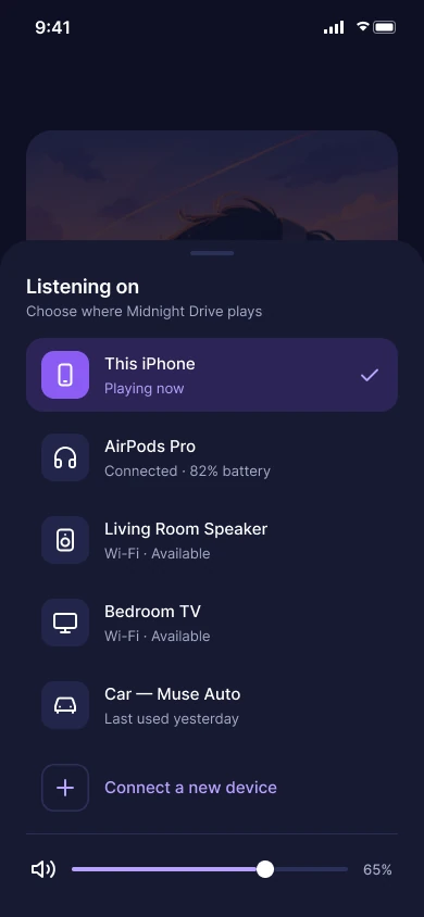
Devices
Choose where to listen, with clear connection status.
States
People should always know whether a track is playing, paused, buffering, liked or downloaded.
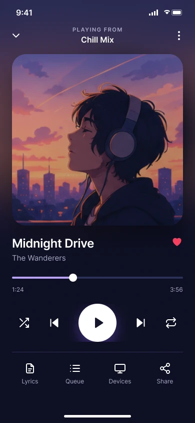
Paused
The position is kept; play replaces pause.
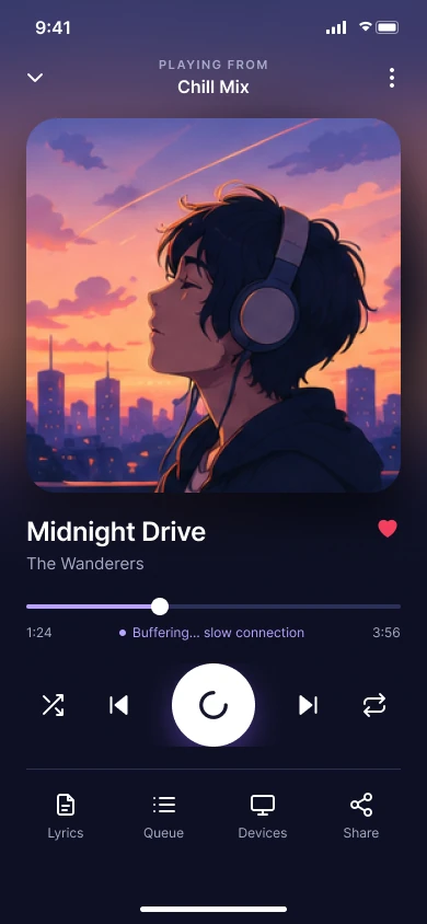
Buffering
A subtle loader and short status, so it never looks frozen.
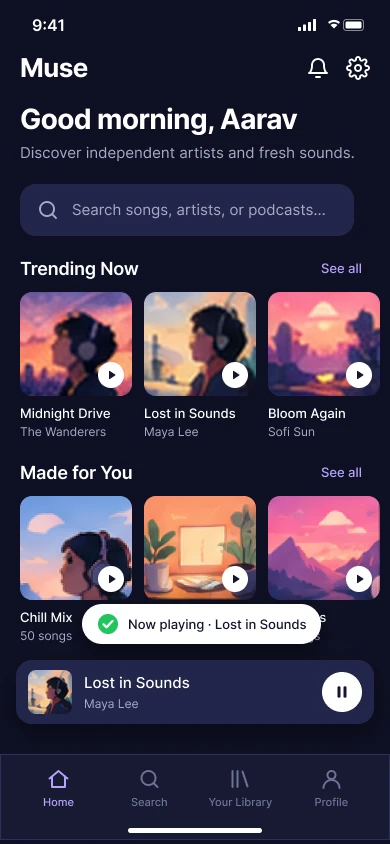
Track changed
Artwork, details and duration update smoothly.
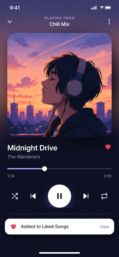
Liked
The heart changes, with a confirmation that doesn't rely on colour.
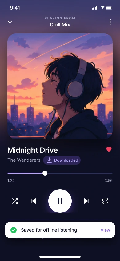
Downloaded
Clear offline availability.
Error and empty states
- No lyrics: a short explanation and a way back to Now Playing.
- Download failed: the reason where possible, and Retry.
- Network lost: offline playback distinguished from a streaming failure.
- Empty queue: how to add the next track from search or a playlist.
Other devices
The brief asks to consider the device playing the music. The same player adapts to how much attention each context allows.
Smartwatch · glanceable
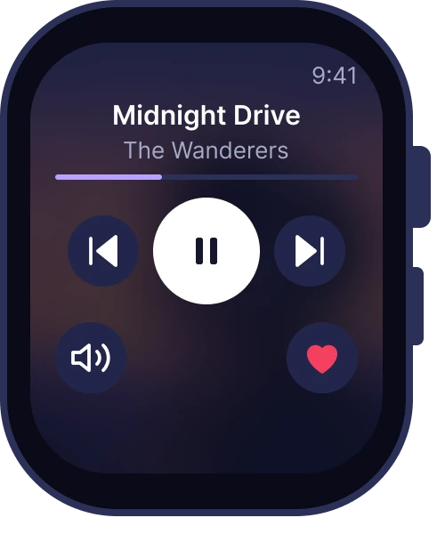
Now Playing
Play/pause, skip, volume and like, readable at a glance.
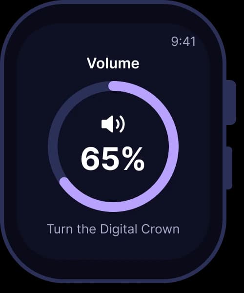
Volume
A single focused control, sized for the wrist.
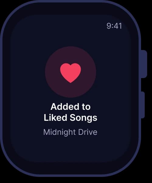
Liked
Instant confirmation without leaving the player.
Car dashboard · driver-safe
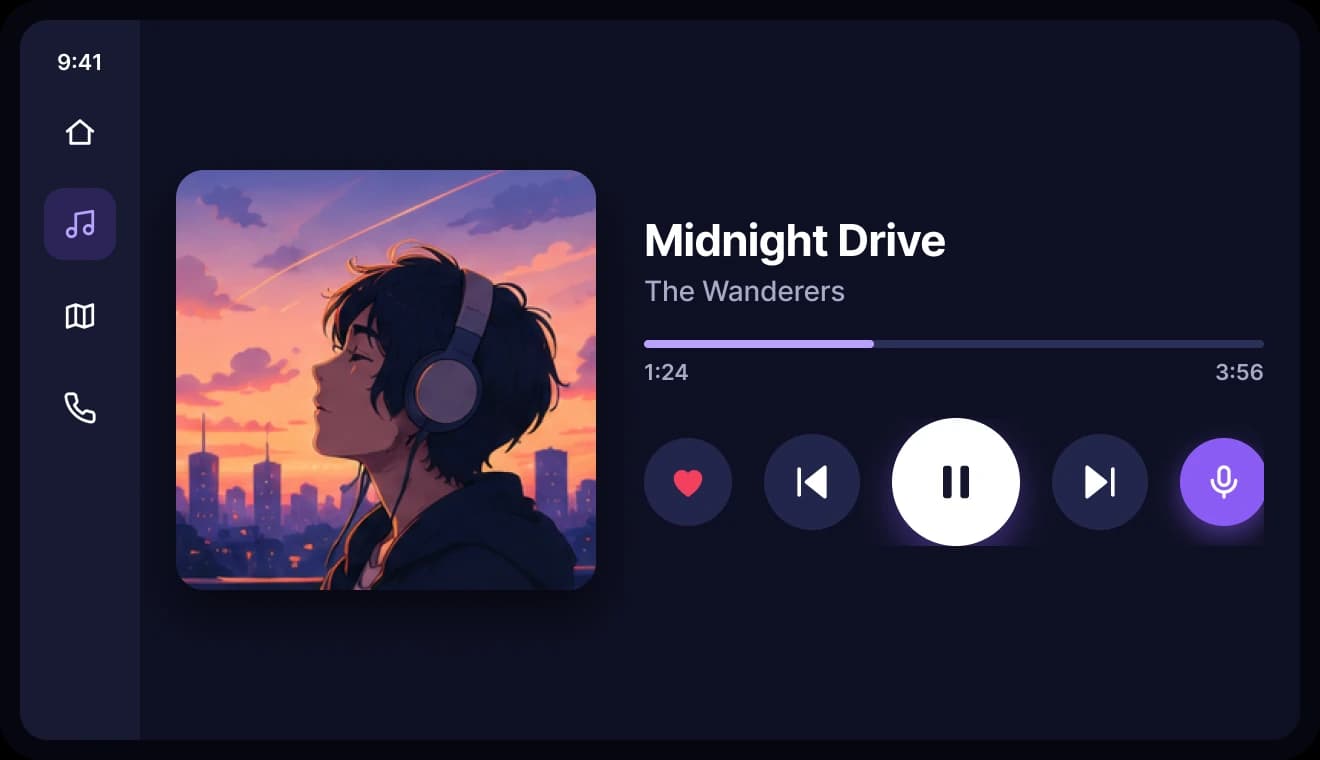
Now Playing
Huge targets and minimal text, so a glance is enough.
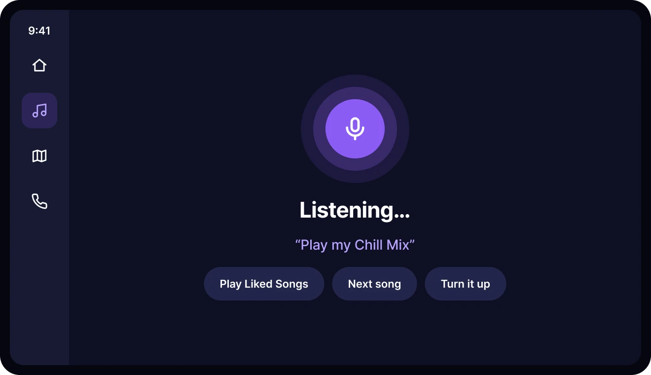
Voice
Voice-first control keeps hands on the wheel.
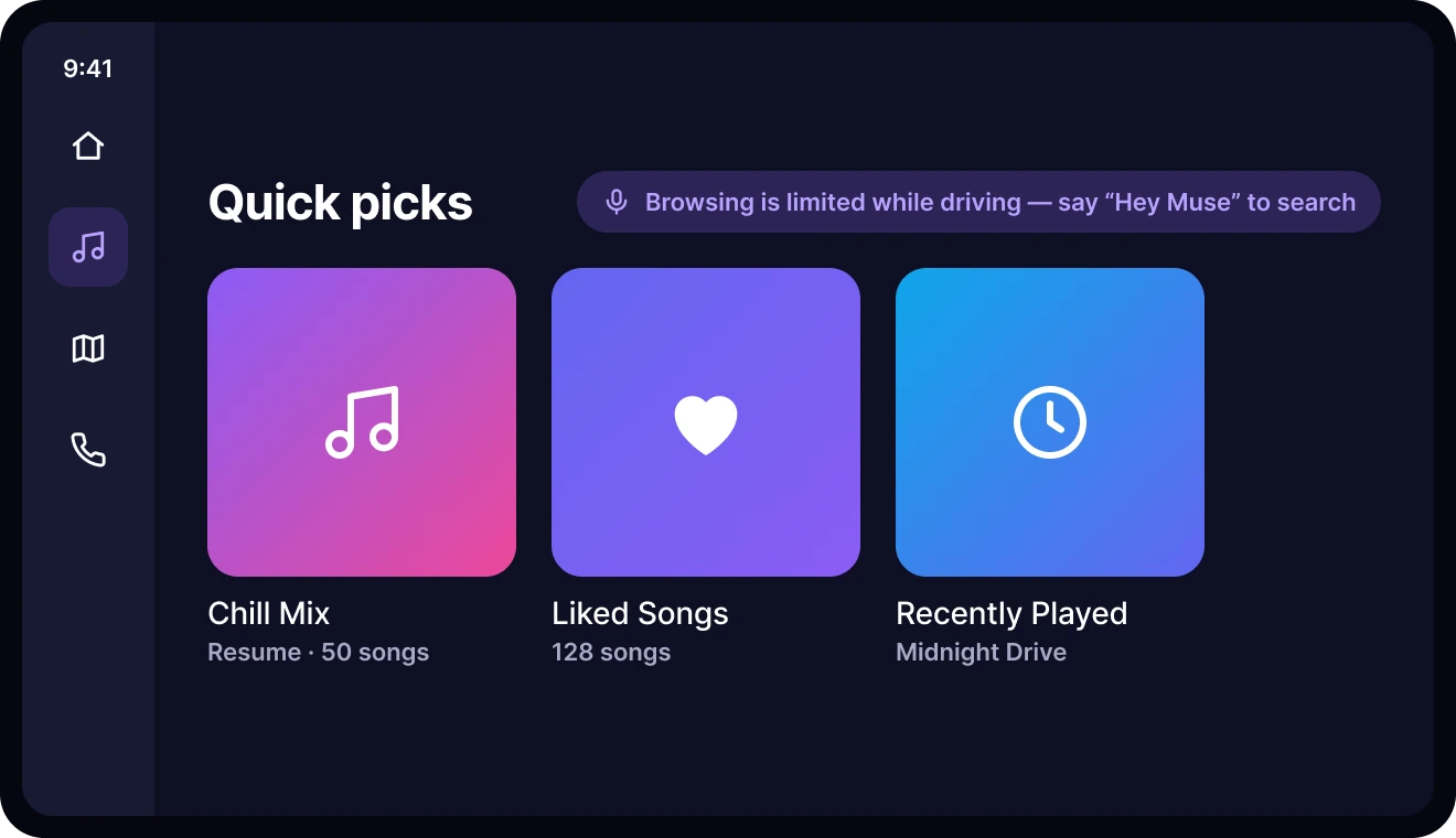
Quick picks
A few large choices instead of browsing while driving.
Context considerations
Accessibility
- WCAG-informed contrast for text and controls, including over artwork.
- Descriptive labels like “Pause track” or “Skip to next track”, not unlabeled icons.
- Touch targets around 44 × 44 pt.
- Shuffle, repeat and liked states announced to screen readers.
- Pink and purple never carry a state alone; icons and labels change too.
- Reduced-motion preferences respected during track changes.
Testing plan
No usability study is claimed. This lightweight plan would validate the main assumptions before implementation.
Key decisions
- 01
Dark theme
An immersive, low-distraction mood, checked for bright environments.
- 02
Large artwork
Emotional connection, without pushing controls off small screens.
- 03
Central play/pause
The most frequent action is the easiest to find.
- 04
Compact extras
Lyrics, queue, devices and share protect the main hierarchy.
- 05
Artwork gradients
Atmosphere and continuity, with text on safe surfaces.
- 06
Dedicated views
Queue and lyrics get room, and playback never resets.
Reflection
The design prioritises focused listening over showing every feature at once. Less frequent actions stay one step away, in clear secondary destinations.
The key learning: visual richness works best when the interaction hierarchy stays simple. A music player isn't only a screen; the watch, the car and background playback are all part of the experience.
Next steps
- An interactive prototype for playback, queue, lyrics and switching tracks.
- Usability tests with 5–7 target users, then revise.
- Screen-reader and large-text testing.
- Developer specs for audio states, offline behaviour and platform media controls.
The full story
Read the full case study
The complete write-up: brief, user, flow, wireframes, design system, states and reflection.