Daily UI #001 · Web
Sign Up
Creatika
A creative community for everyone. Sign up in seconds and start sharing your work.
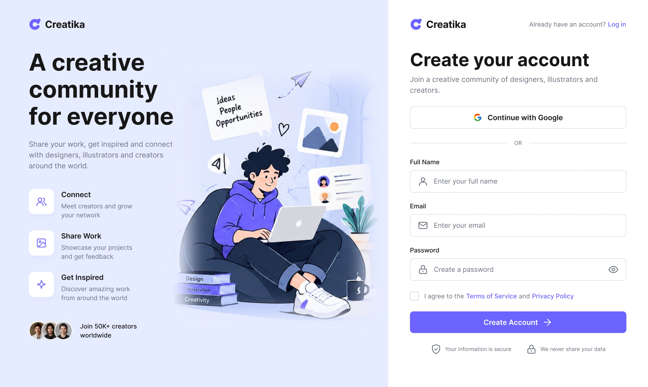
Hover the screens to scroll through them.
The brief
Design a clear, friendly sign-up experience that helps a first-time user create an account with minimal friction.
Daily UI #001
“Create a sign-up page, modal, form, or app screen related to signing up for something.”
Instead of treating the prompt as a purely visual exercise, I turned it into a realistic product scenario with a real user goal.
Concept
Creatika is an online creative community for designers, illustrators and creators. A creator discovers it and wants to join, connect with others and eventually share their own work.
Core user goal
“I want to create an account quickly, without unnecessary information, so I can start exploring the community.”
The problem
Generic sign-up flows add friction: long forms, unclear requirements, confusing validation and little guidance about what happens after registering.
Target user
- Persona
- Riya, 24 · UI/UX Designer
- Needs
- Quick registration, clear information, a trustworthy experience.
- Motivation
- Discover work, connect with designers, share creative projects.
- Frustrations
- Long forms, unclear errors, unnecessary questions.
UX goals
- Keep registration to the essential information.
- Make the primary action recognisable at a glance.
- Offer a faster social sign-up option.
- Show validation clearly, right next to the field it's about.
- Give confidence about privacy and what happens next.
User flow
Profile setup and personalisation are deliberately left until after the account exists, so nothing stands between the user and joining.
- Discover
- Sign up
- Google or manual
- Name, email, password
- Accept terms
- Create account
- Welcome
Wireframes
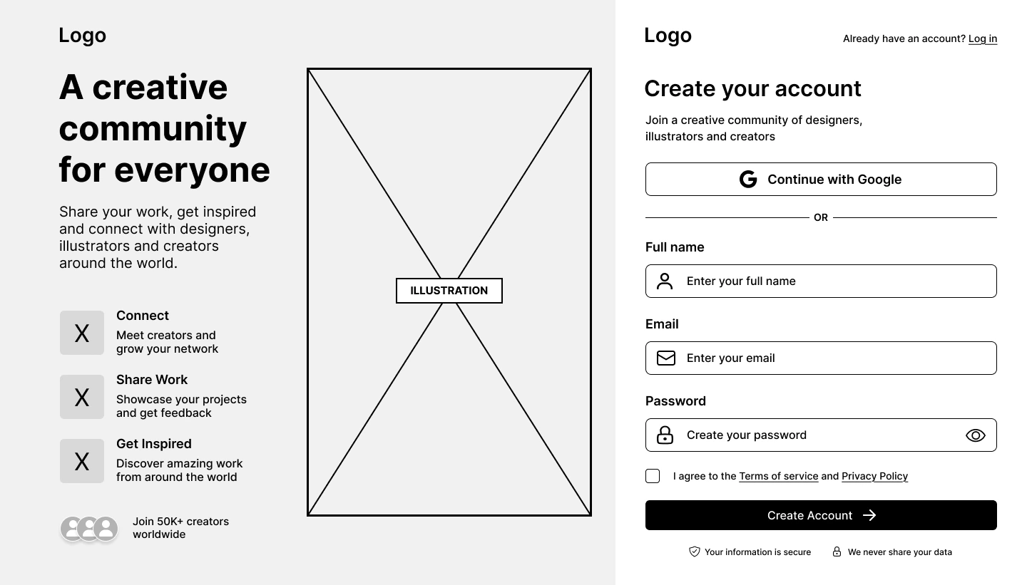
Three layouts explored before any visual styling.
- A
Centered form
Minimal and focused. Best when registering is the only priority.
- B · Chosen
Split screen
Pairs the form with the product's personality and community benefits.
- C
Card layout
The form sits in a prominent card over a contextual creative background.
Information architecture
Design system
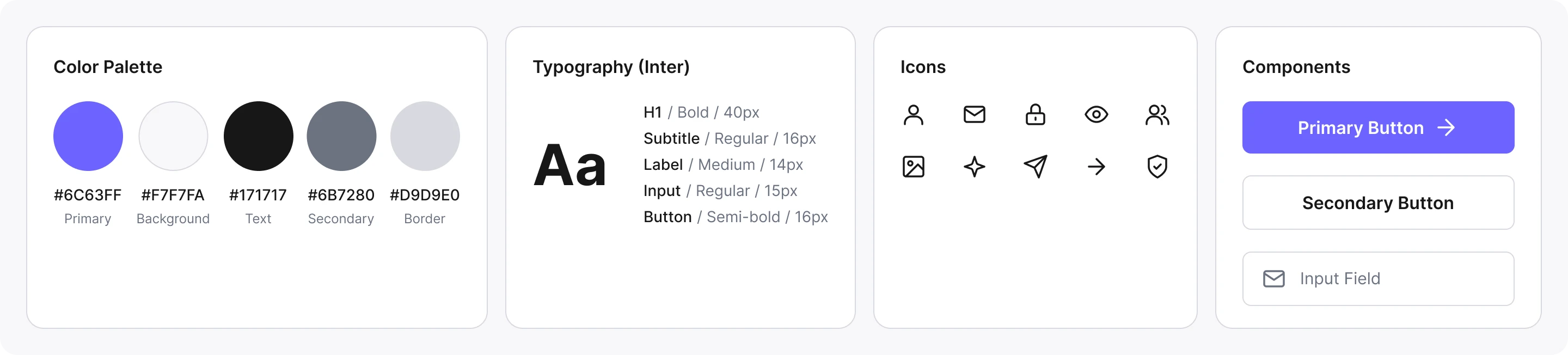
Modern, creative and friendly, but professional: generous spacing, rounded controls, restrained shadows and one strong accent, so the illustration adds personality while the form stays the main task.
Final UI
The split-screen layout: community value on the left, a short form on the right. Hover to explore.
Sign up
Google or email in three fields, with trust cues right under the button.
Interaction states
Key decisions
- 01
Less to think about
Only the essential fields appear up front.
- 02
Clear hierarchy
Heading, message, form and button in a predictable order.
- 03
Fast path
Google sign-up as an alternative to typing.
- 04
Trust cues
Privacy and security reassurance at the moment of hesitation.
- 05
Community context
The illustration shows why to join, not just decoration.
Accessibility
- Labels stay visible instead of relying on placeholders.
- Text and controls keep sufficient contrast.
- Error messages are descriptive and tied to their field.
- Interactive elements have comfortable touch targets.
- Keyboard users move through the form in a logical order.
Reflection
Success means a first-time visitor understands the screen immediately, registers without confusion, recovers from common input errors and knows what happens next.
The biggest lesson was treating a Daily UI exercise as a small UX problem, moving from “what should this screen look like?” to “what does the user need to do, and what makes that easier?”
Takeaways
- Form simplicity
- Visual hierarchy
- Interaction states
- Building trust
- Designing within a realistic product context
The full story
Read the full case study
The complete write-up: brief, user, flow, wireframes, design system, states and reflection.