Daily UI #006 · Mobile app
Settings
CreateHub
Privacy and security settings that explain first, control second and confirm when necessary.
Hover the screens to scroll through them.
The brief
Let people find important controls quickly, understand what each option does and change sensitive settings with confidence.
Daily UI #006
“Design settings for something, such as security, privacy, game settings, appearance or system controls.”
Concept
Instead of a generic list of app settings, this focuses on Privacy & Security for CreateHub, the creative community from #005. These settings matter most: they affect account protection, visibility, communication and personal data.
- Platform
- Mobile app, designed at 390 × 844.
- Focus
- Scannable, touch-friendly controls, clear grouping and safe interaction patterns.
Target user
- Persona
- Riya Sharma, 26 · Product Designer
- Goal
- Control who can access her account and interact with her.
- Needs
- Clear explanations, visible setting states, secure account controls, easy recovery from mistakes.
- Frustrations
- Technical language, hidden controls, not knowing what a change will do.
User goal
“I want to easily understand and control who can access my account and interact with me.”
The problem
Security settings get overwhelming with technical terms, too many options and unclear consequences. Good settings make the current state obvious and explain important consequences before you commit.
UX principle
- Explain first
- Show current state
- Let users control
- Confirm sensitive actions
Information architecture
Related controls are grouped so nobody scans one long list, and high-risk actions are kept apart from everyday preferences.
User flow
- Open Settings
- Review security
- Privacy & Security
- Choose a setting
- See current state
- Change it
- Confirm if sensitive
- Get feedback
Choosing the right control
Every setting gets the control that matches what it does, with a short description wherever the label alone wouldn't explain the consequence.
- Switch
Simple, reversible preferences
Show activity status, show followers list.
- Radio
Mutually exclusive choices
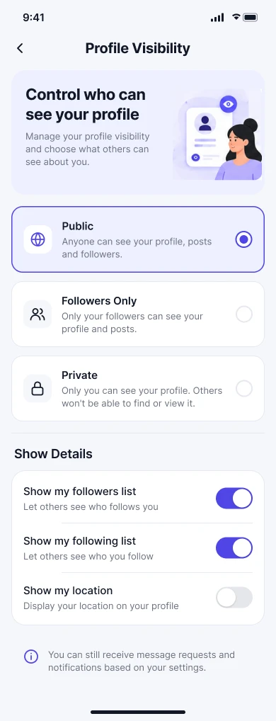
Profile visibility: Public, Followers only or Private, each explaining who can see what.
- Confirm
Sensitive actions
Password changes, account deletion and security changes ask for confirmation, and identity verification where needed.
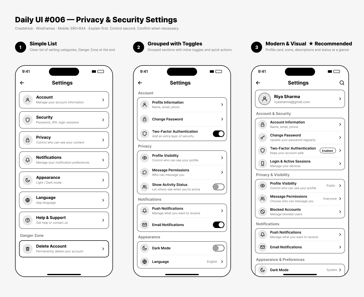
Wireframes
Three directions, from a plain list to a guided settings experience.
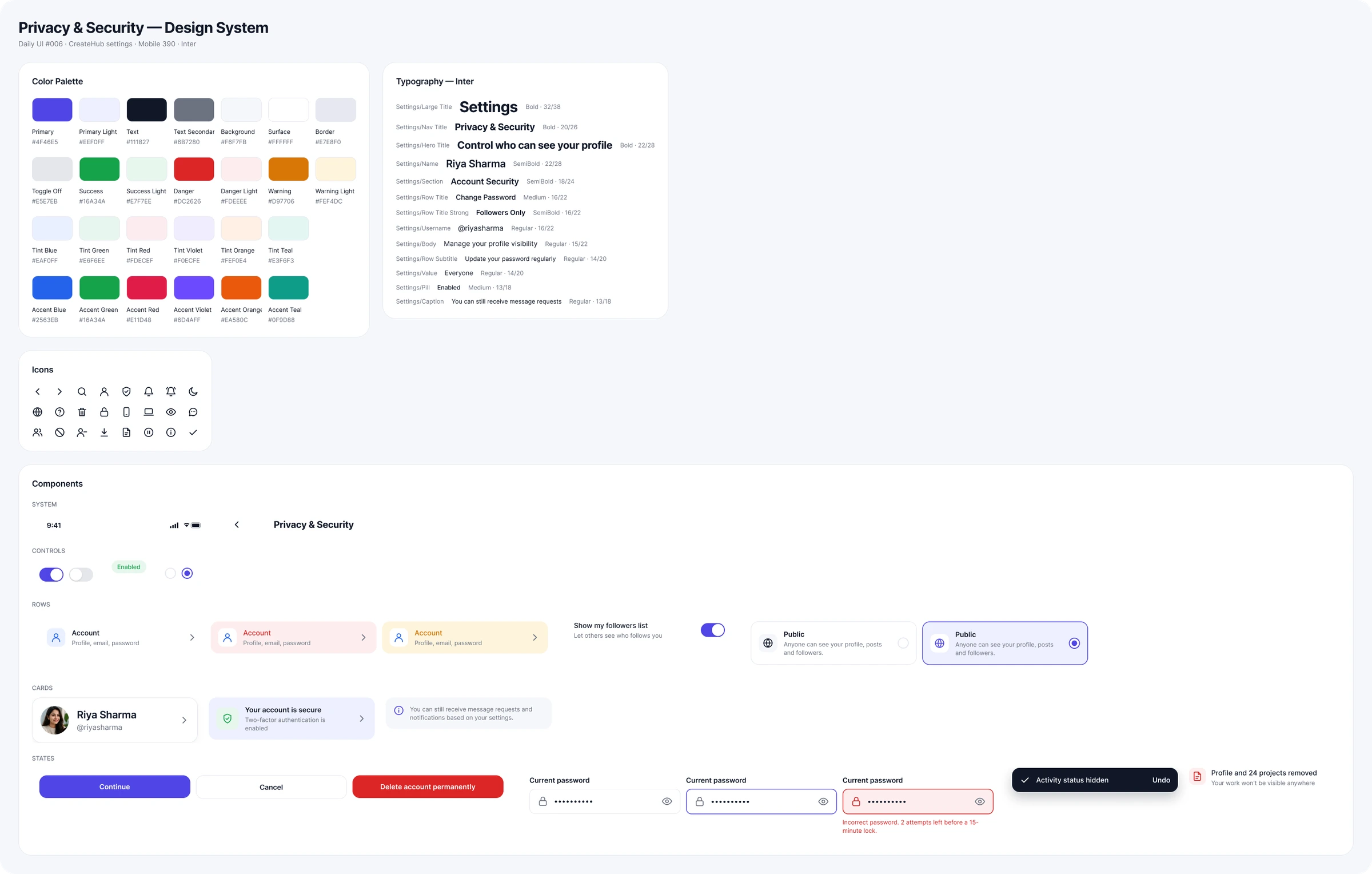
Design system
Clean, minimal and trustworthy: Inter with strong section headings, concise descriptions, rounded surfaces and restrained icons. Green signals security, and red is reserved for destructive actions.
Final UI
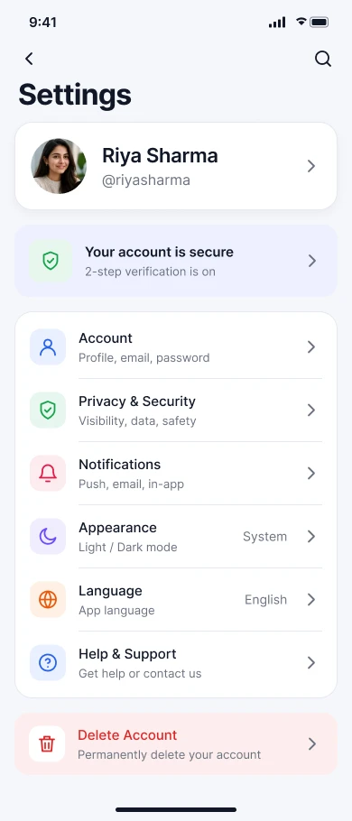
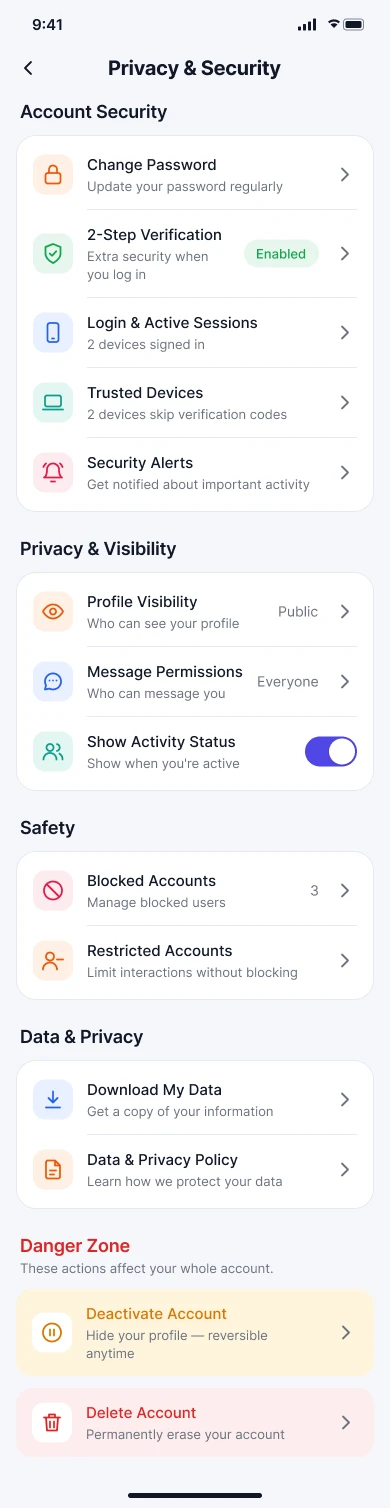
A personal Settings overview with a security summary, grouped Privacy & Security controls and a detailed Profile Visibility screen, plus every state around them. Modern and friendly, while treating privacy as a serious responsibility. Hover a screen to scroll it.
Settings
Profile, “Your account is secure” and grouped categories.
Privacy & Security
Security, visibility, safety, data and a separate danger zone.
Profile visibility
Public, followers only or private, each explained.
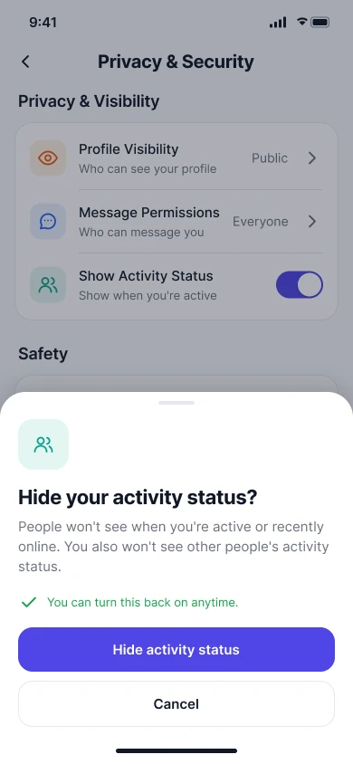
Confirmation
Explains the consequence before hiding activity status.
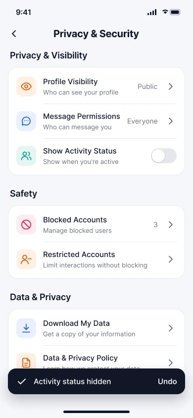
Toggled off
A toast confirms the change, with Undo.
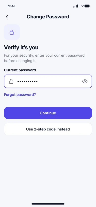
Verify it's you
Identity check before changing the password.
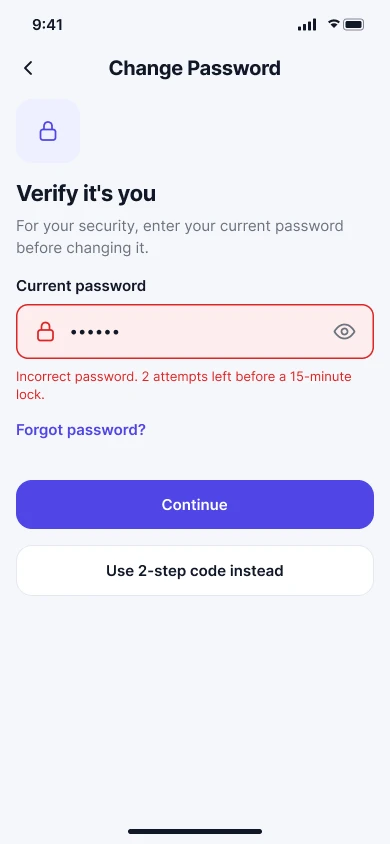
Error
A wrong password says how many attempts remain.
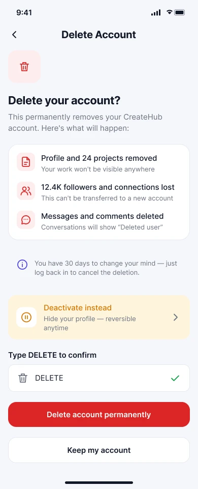
Delete account
Spells out what's lost, offers deactivation and asks you to type DELETE.
States & recovery
Danger zone
Delete Account lives in its own, visually distinct section. It needs explicit confirmation and explains permanence and consequences. Destructive styling is reserved for things that genuinely can't be undone.
Privacy, accessibility & responsive
- Defaults are understandable choices, not hidden assumptions.
- People always know what's public, who can contact them and what activity is visible.
- Sensitive account information is never exposed unnecessarily.
- Sufficient contrast, readable labels, described icons, logical focus order and large touch targets.
- Enabled and disabled states are never shown by colour alone.
- On larger screens, a two-pane layout with categories on the left and details on the right keeps the same hierarchy.
Key decisions
- 01
Grouped settings
Less scanning effort.
- 02
Security summary
Immediate reassurance.
- 03
Descriptive labels
Important consequences are explained.
- 04
The right controls
Switches, radios and navigation, each where it fits.
- 05
Confirm sensitive actions
Prevents accidental changes.
- 06
Separate danger zone
Destructive actions stay away from everyday settings.
- 07
Consistent states
You always know whether a change worked.
Reflection
Success means someone can find an important setting quickly, understand what it controls, see its current state, change it confidently and understand the consequences of sensitive actions.
The key learning: settings UX isn't about listing every option. It's about organisation, clarity and safe control. Nobody should have to guess what a setting means, what state it's in, or what will happen when they change it.
The full story
Read the full case study
The complete write-up: brief, user, flow, wireframes, design system, states and reflection.