Daily UI #007 · Web
404 Page
CreateHub
A 404 page that turns a dead end into a way forward.
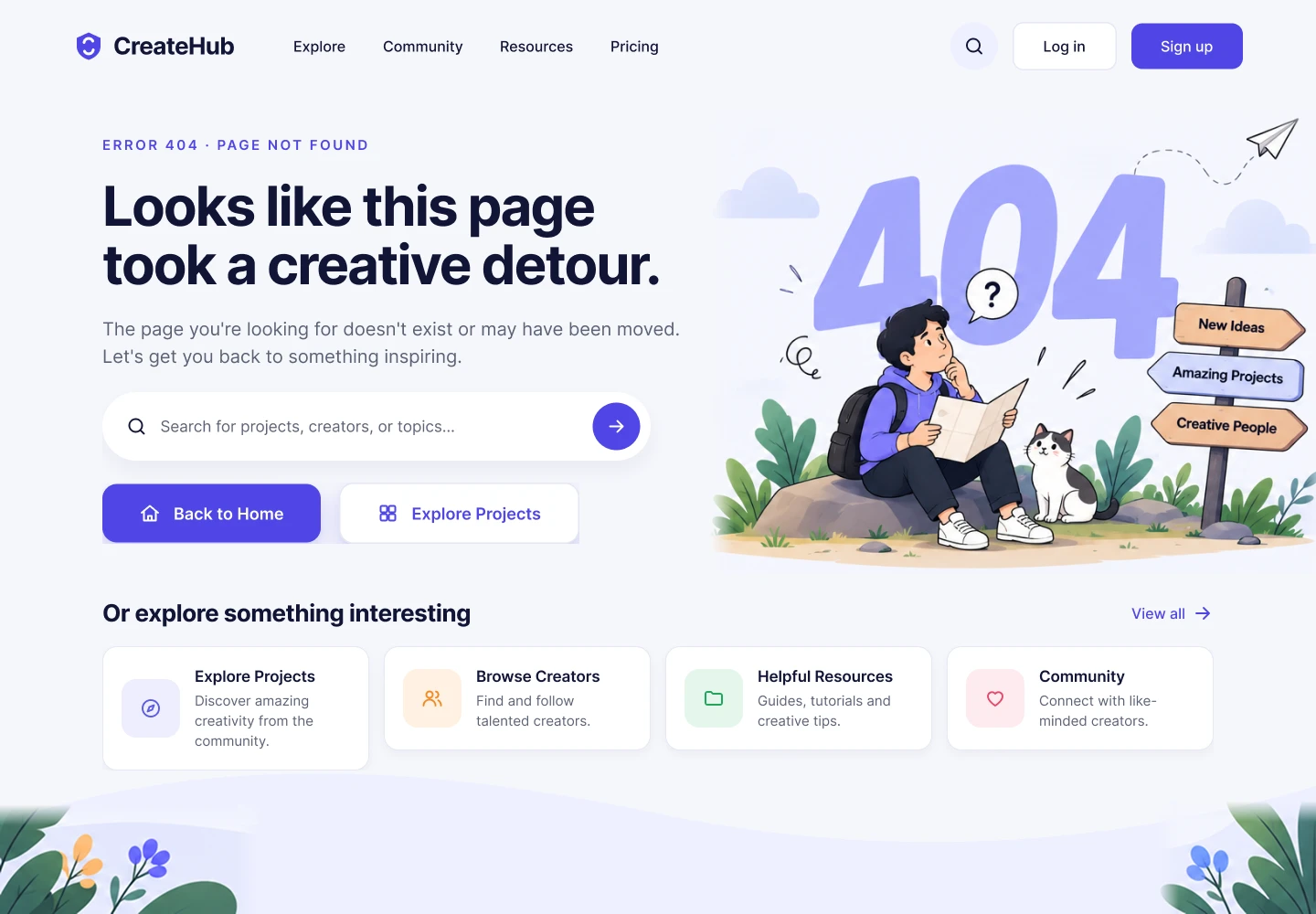
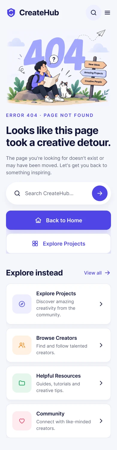
Hover the screens to scroll through them.
The brief
Explain clearly what went wrong, and give people useful ways forward.
Daily UI #007
“Design a 404 page that's not boring. Consider brand style, usability and how the page can help people recover from the error.”
Concept
A 404 for CreateHub, the creative community from #005 and #006, designed to feel like a natural part of the product rather than a generic browser error.
- Platform
- Responsive web, desktop first.
- How people get here
- A mistyped URL, an old project link, a deleted page or a broken external link.
User goal
“I can't find the page I wanted, but help me get somewhere useful.”
The problem
A traditional 404 only says something went wrong. With no clear way out, frustration grows and people leave the product.
UX goals
- Explain the problem immediately.
- Keep the tone friendly without making the error feel unserious.
- Offer one clear primary recovery action.
- Offer search as an alternative way back.
- Give people useful content to explore.
- Keep CreateHub's brand personality.
- Avoid overwhelming people with choices.
Content strategy
Friendly and human, but never blaming the visitor. The headline adds personality; the supporting copy stays direct about what happened.
Page not found
Looks like this page took a creative detour.
- Supporting copy
- The page you're looking for doesn't exist or may have been moved. Let's get you back to something inspiring.
- Primary CTA
- Back to Home
- Secondary CTA
- Explore Projects
- Search
- Search for projects, creators or topics.
Information architecture
Recovery paths
Different visitors need different ways back, so the page offers several without crowding the screen.
- Hit a 404
- Understand the error
- Choose a way back
- Keep browsing
- 1
Back to Home
The fastest way back for anyone who's lost.
- 2
Search
Best when you know what you were looking for.
- 3
Explore Projects
For browsing rather than hunting for one page.
- 4
Creators, resources, community
Secondary discovery options.
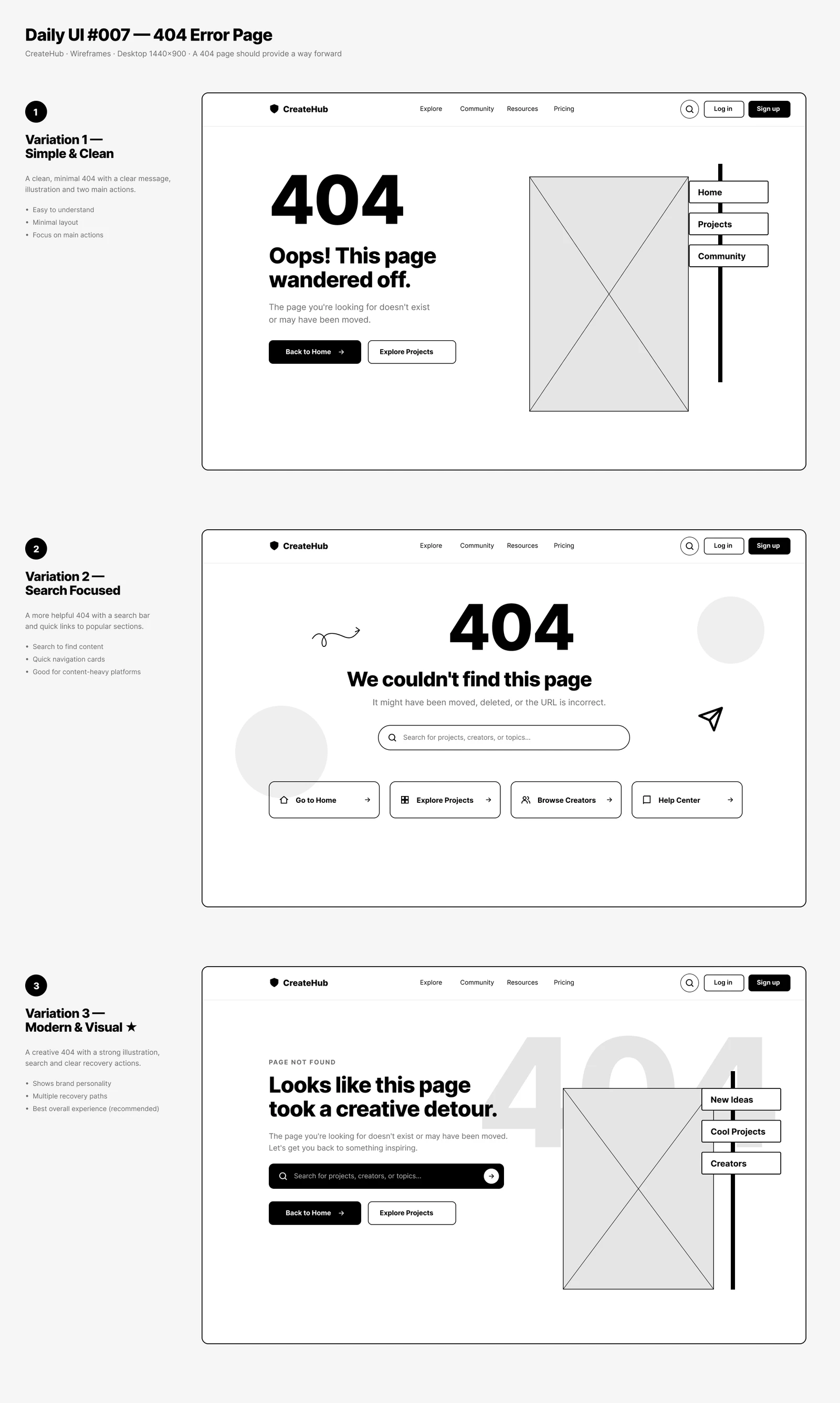
Wireframes
Three desktop directions at 1440 × 900.
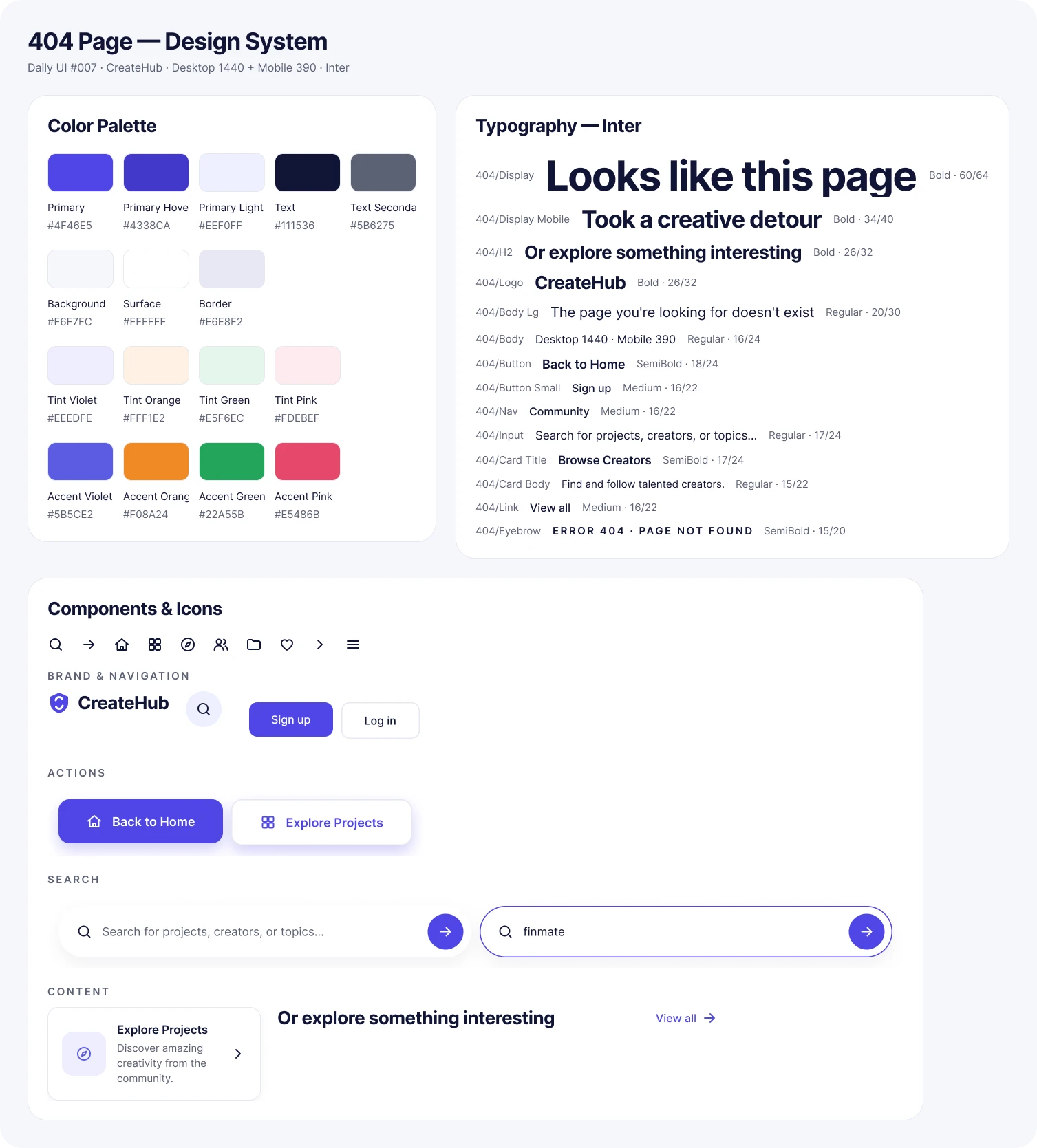
Design system
Creative, minimal and friendly: CreateHub's rounded surfaces, purple-blue accents, soft lavender backgrounds and Inter, with oversized 404 numerals and a strong headline.
Final UI
A strong 404 visual, friendly headline, search, clear recovery buttons and discovery cards. It feels intentionally designed, not like a technical failure. Hover to scroll.
Desktop
Message and recovery on the left, the illustration on the right, discovery cards below.
Mobile
Stacked so the message, search and Back to Home stay near the top.
States & responsive
Accessibility
- Strong text contrast and a logical heading hierarchy.
- Meaningful link and button labels.
- Keyboard-accessible search and navigation, with visible focus states.
- Alternative text for the illustration.
Key decisions
- 01
Useful before clever
Clear recovery comes before decoration.
- 02
Search as recovery
Helps people find what they meant to.
- 03
Brand personality
The creative-detour idea makes the error memorable.
- 04
Several ways back
Home, search and explore suit different intentions.
- 05
Persistent navigation
Keeps people oriented.
- 06
Helpful discovery
A dead end becomes a chance to explore.
- 07
Responsive hierarchy
The main way back stays reachable on small screens.
Reflection
Success means visitors understand within seconds that the page is unavailable, know what to do next, can search or get home easily, and still recognise CreateHub.
The key learning: an error state is still part of the product. A 404 shouldn't just announce failure; it should reduce frustration, restore orientation and help people carry on with what they came to do.
The full story
Read the full case study
The complete write-up: brief, user, flow, wireframes, design system, states and reflection.