Daily UI #005 · Mobile app
User Profile
CreateHub
A creator profile that shows who you are, what you do and what you've made.
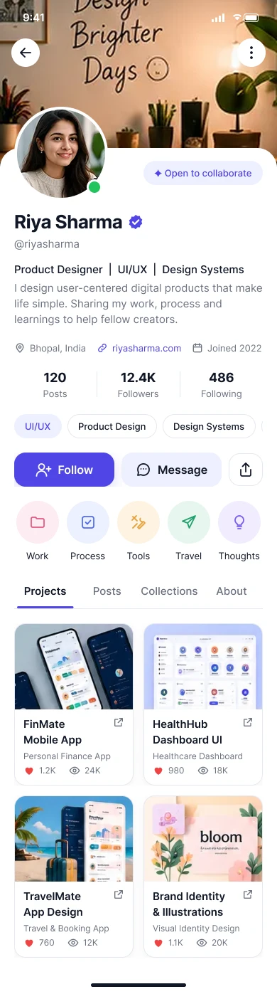
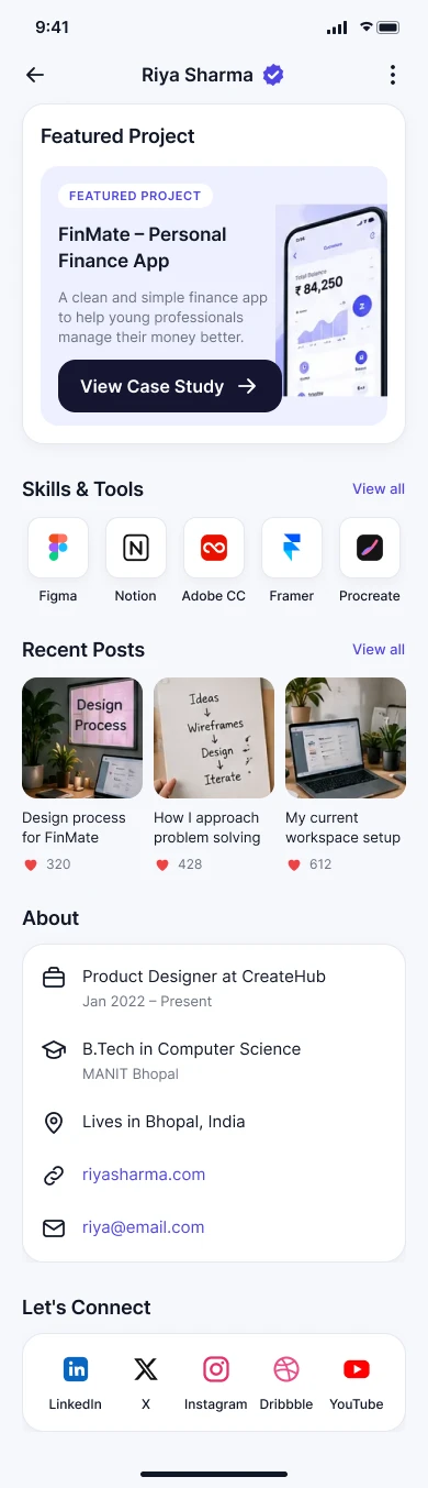
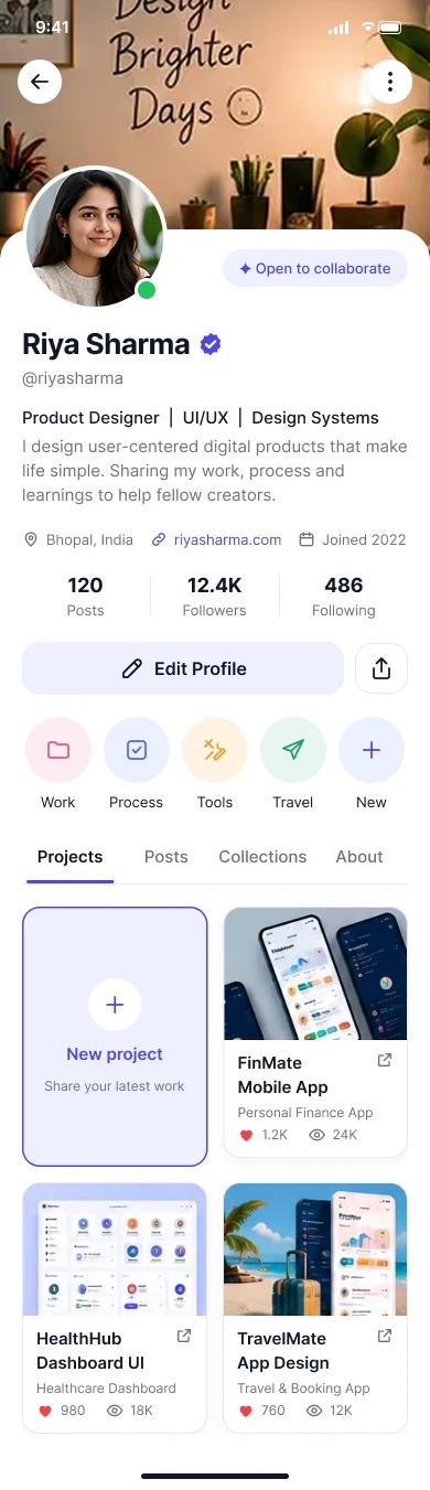
Hover the screens to scroll through them.
The brief
Help visitors quickly understand who someone is, what they do, what they've made and how to connect with them.
Daily UI #005
“Design a user profile and consider the most important data, names, imagery, placement and the profile's purpose.”
Concept
CreateHub is a creative community for designers, illustrators, developers and creators. The profile belongs to Riya Sharma, a product designer, and reads as a professional-creative identity rather than a purely social profile: personal identity, portfolio-style work and community signals together.
- Platform
- Mobile app, designed at 390 × 844.
- Why mobile
- Clear hierarchy, compact information, touch-friendly actions and quick content discovery.
Who it's for
Profile owner · Riya, 26
- Communicate who she is.
- Showcase selected work.
- Build credibility.
- Grow her creative network.
Visitor · designer, recruiter or collaborator
- Understand her role quickly.
- See her work.
- Decide whether to follow or get in touch.
The problem
Profiles get overwhelming when everything competes for attention. Visitors need a hierarchy that answers four questions fast: who is this, what do they do, what have they made, and how do I connect?
Core UX principle
- Identity
- Credibility
- Content
- Connection
Information architecture
User flow
From light identity information to deeper content, so visitors choose how far to explore.
- Discover profile
- Identify creator
- Read bio
- Check social proof
- Browse projects
- Open project
- Follow, message or share
Profile header
A large avatar, name, verification and role establish identity immediately. The cover photo adds personality but stays secondary to the face and name.
Essential information
- Name
- Riya Sharma
- Role
- Product Designer | UI/UX | Design Systems
- Username
- @riyasharma
- Bio
- I design user-centered digital products that make life simple.
- Details
- Location, website and join date
Content & project cards
Clear tabs for Projects, Posts and Collections, with Projects first because Riya is presented as a professional creator.
Each project card shows enough to decide whether to open it
- A strong visual thumbnail, always the dominant element.
- Project title and category.
- A small engagement signal.
- Optional tags.
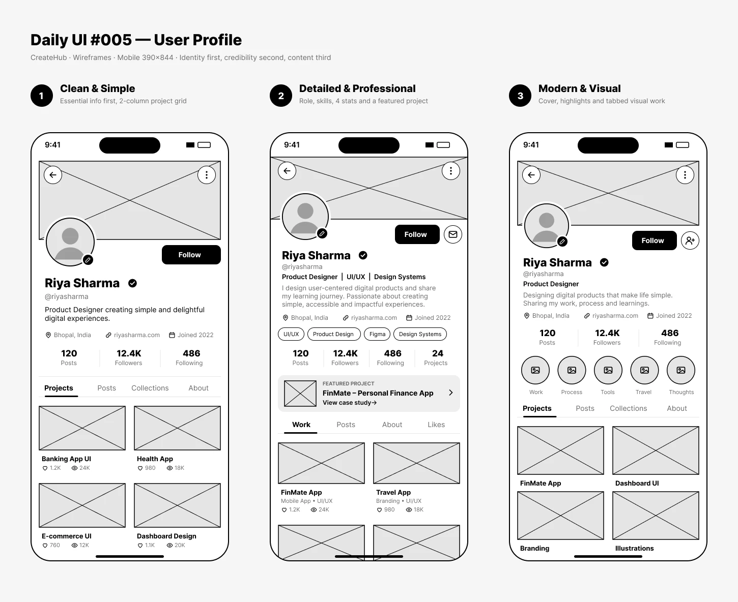
Wireframes
Three mobile directions, all built on identity first, credibility second and content third.
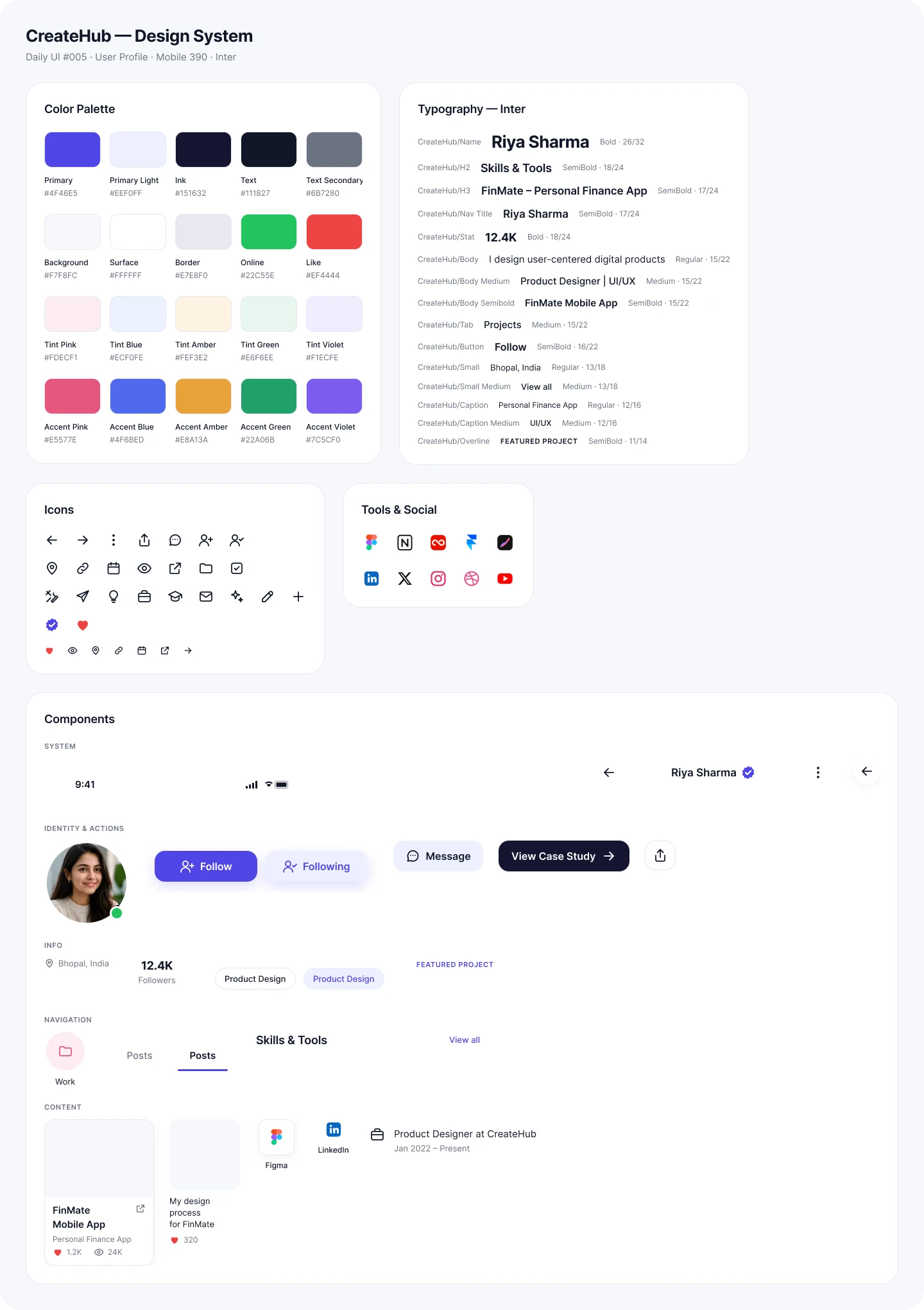
Design system
Modern, creative and professional: Inter with a large name, clean cards, subtle borders, rounded controls and generous spacing, polished without feeling like a generic social network.
Final UI
A creative portfolio inside a community product, not a generic social profile. Hover a screen to scroll it.
Profile
Identity, bio, stats, highlights and the project grid.
About
Featured project, skills and tools, recent posts and ways to connect.
Own profile
Edit Profile replaces Follow, with a “New project” card in the grid.
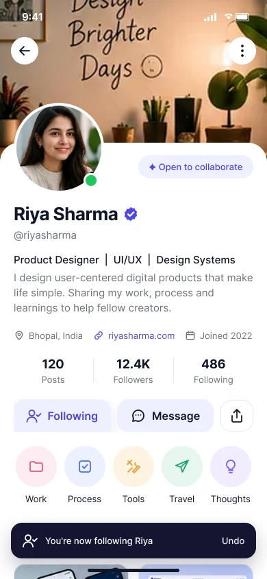
Following
The button flips to Following, with an Undo toast.
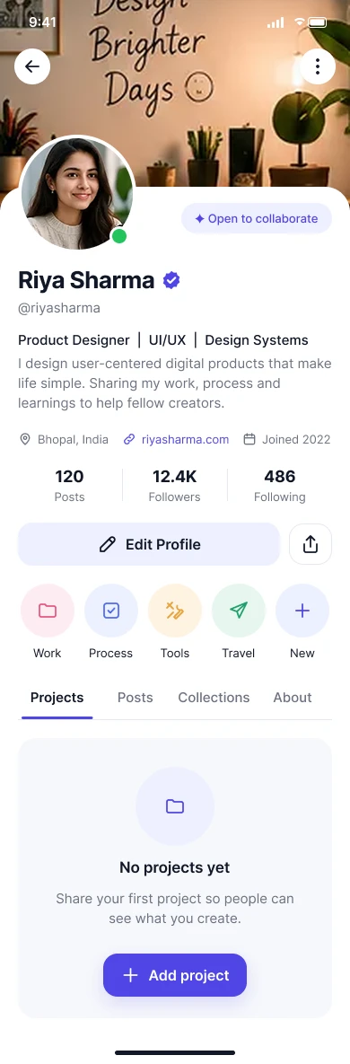
No projects yet
A friendly empty state that invites the first project.

Loading
Skeletons keep the layout steady while content loads.
States
Privacy & accessibility
A profile shows only what its owner chose to share. Location, website, follower information and activity respect privacy settings, and sensitive information is never shown by default.
Accessibility
- Readable text sizes and sufficient contrast.
- Meaningful labels for icons and descriptions for images.
- A logical focus order and touch-friendly controls.
- Verification and follow state never shown by colour alone.
- On larger screens, a wider header and multi-column grid keep the same hierarchy.
Key decisions
- 01
Identity first
Name, avatar and role are visible immediately.
- 02
Concise bio
Enough context, no wall of text.
- 03
Work over metrics
Projects outrank follower counts.
- 04
Clear tabs
Easy switching between content types.
- 05
Contextual actions
Follow and Message are always easy to find.
- 06
Professional + creative
Personality without sacrificing usability.
- 07
Privacy-aware
Information stays under the owner's control.
Reflection
Success means that within a few seconds a visitor knows who the person is, what they do, their community presence, what they've made and how to connect.
The key learning: profile design is fundamentally about information hierarchy. A good profile doesn't show everything equally; it guides the visitor from identity to credibility, then to work, and finally to interaction.
The full story
Read the full case study
The complete write-up: brief, user, flow, wireframes, design system, states and reflection.