Selective redesign · Mobile app
Airbnb
From browsing stays to understanding exactly what you're booking.
A conceptual mobile redesign that makes rooms, beds, bathrooms, privacy and booking terms easy to understand before guests commit, in Airbnb's own visual language.
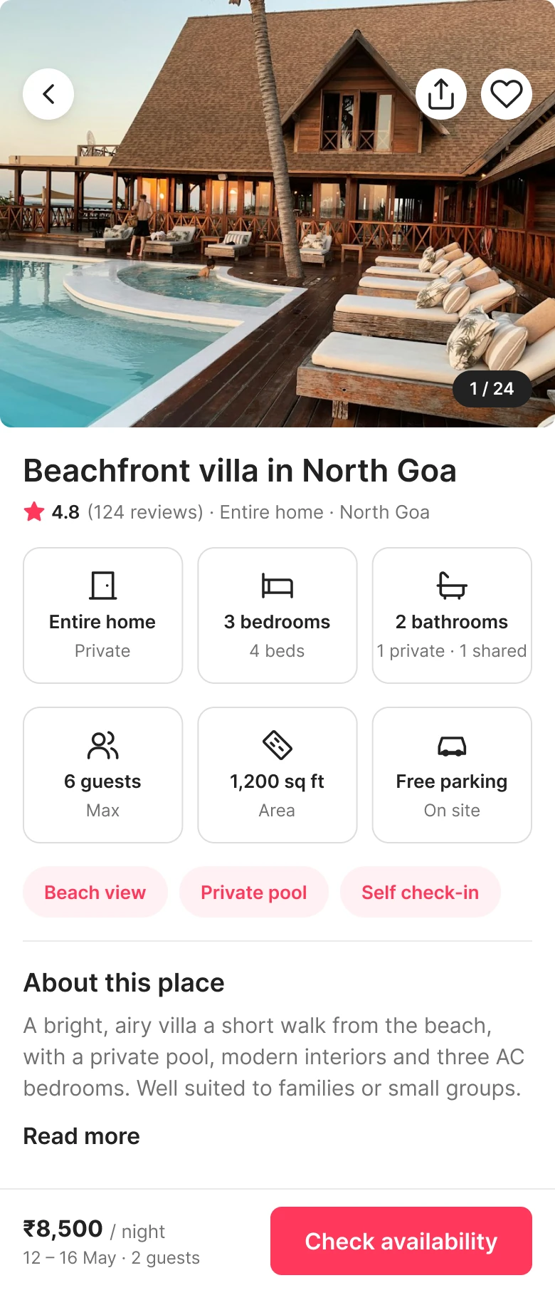
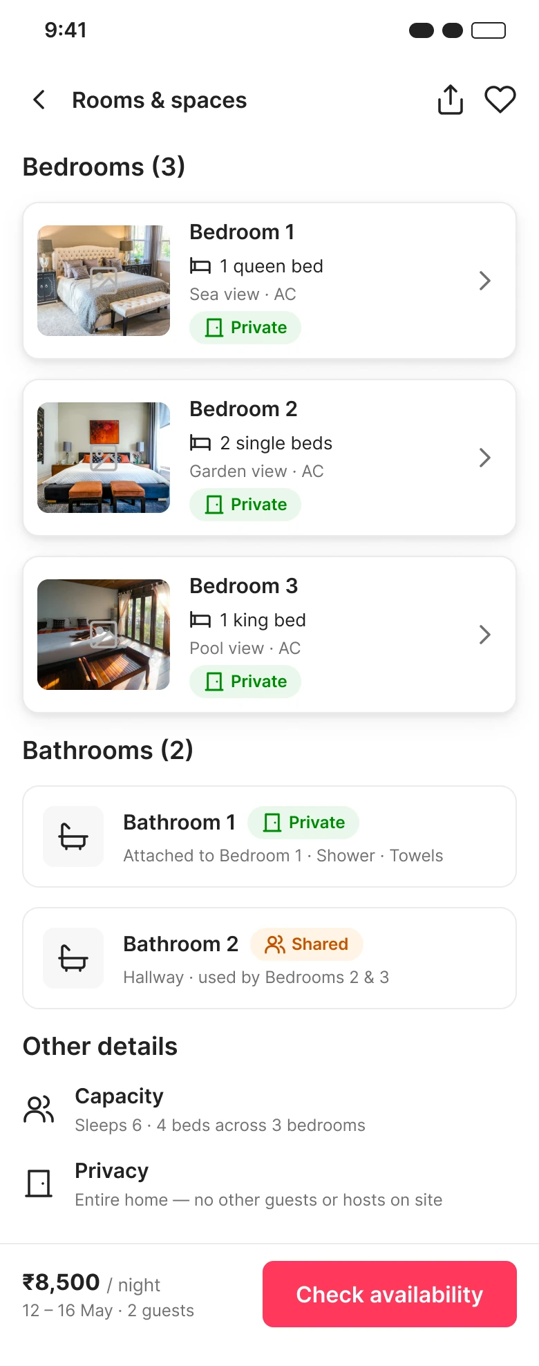
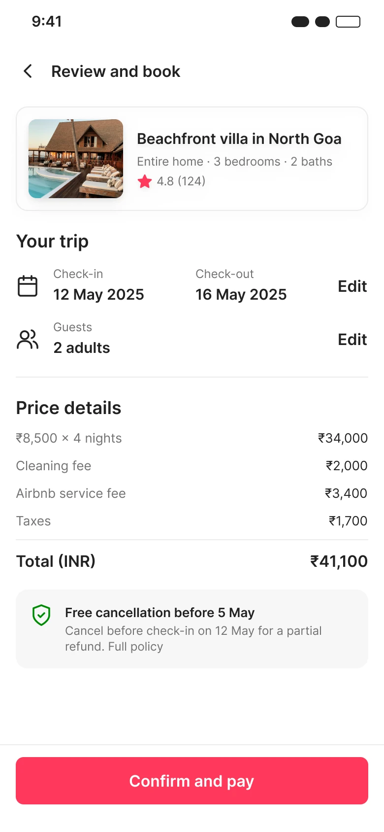
Hover the screens to scroll through them.
Overview
Choosing a stay is more than liking a photo or a nightly rate. Guests need to understand rooms, beds, bathrooms, privacy and booking terms.
- Product
- Airbnb: guest-side accommodation booking
- Platform
- Mobile app concept
- Focus
- Rooms, privacy, property details and booking terms
- Methods
- Exploratory audit, desk research, IA, flows, wireframes, UI
- Out of scope
- Host tools, payments, accounts, the rest of Airbnb
UX audit
12 checks across search results, photos, room details and booking review, from one exploratory audit.
- Clear · 1
- Total price for the chosen dates and guests.
- Partly clear · 6
- Details exist but are hard to find or read.
- Difficult · 5
- Telling listings apart, understanding spaces, judging condition.
Direction
Prioritise understanding the accommodation, and keep Airbnb's existing strength: a visible total price.
Persona & JTBD
The careful family traveller (provisional)
Goals
- Understand the real room layout and sleeping arrangements.
- Confirm bathroom access and what's private or shared.
- Check amenities, house rules and relevant reviews.
- Know the total price before committing.
Frustrations to investigate
- Similar listings are hard to tell apart.
- Room details need extra searching.
- Photos don't answer layout questions.
- Missing information creates doubt.
Job to be done
“When planning a family trip, I want to understand rooms, privacy and total cost, so I can choose a stay that meets our needs.”
The problem
When photos and details don't fully answer their questions, travellers struggle to judge a property's layout, condition and privacy, and to book with confidence.
Design principles
- 01
Clarity first
Clarity before decoration.
- 02
Never guess
Use verified listing details; show what's missing.
- 03
Room context
Show which space a photo shows, not just nice images.
- 04
Easy to scan
Privacy, beds and bathrooms at a glance.
- 05
No surprises
Total price and terms clear before booking.
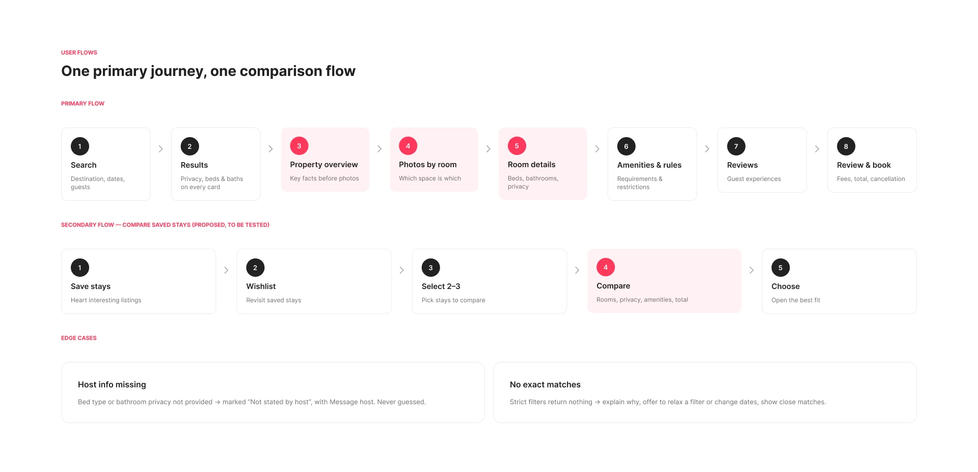
IA & user flow
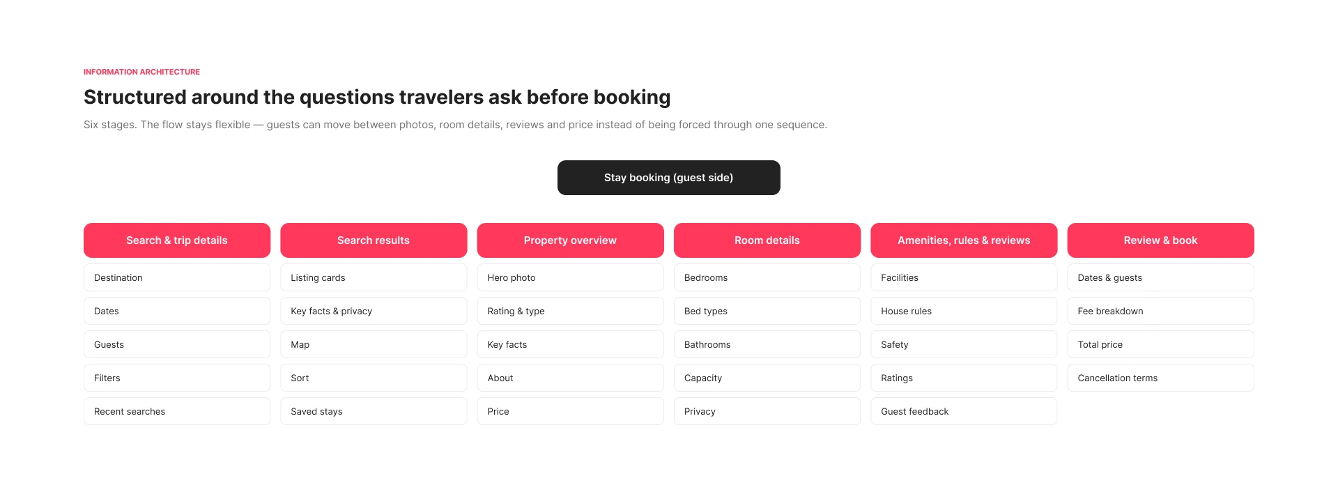
The flow stays flexible: guests can move between photos, rooms, reviews and price instead of following one fixed path.
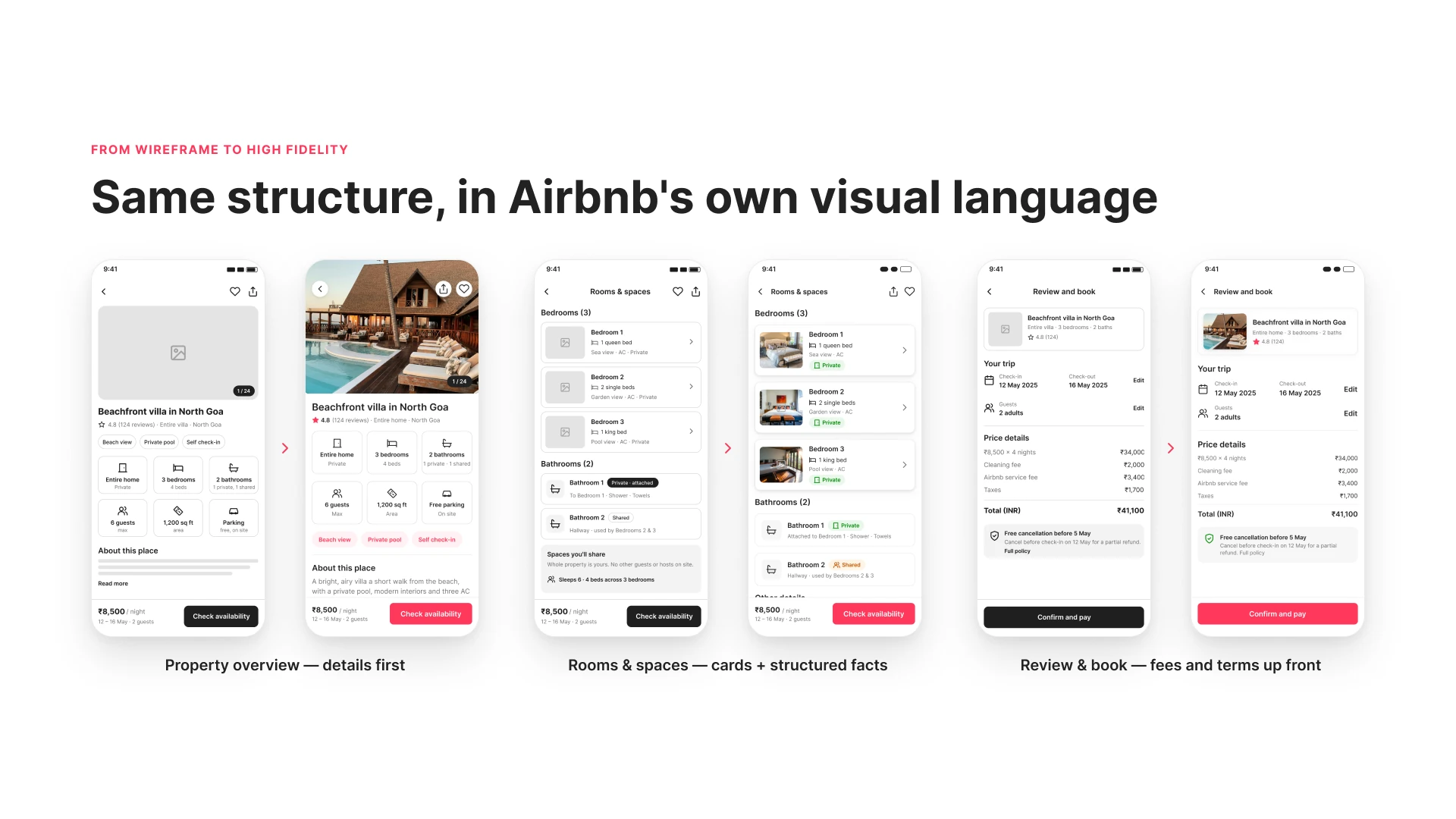
Wireframes to hi-fi
Mid-fidelity grayscale wireframes settled the structure first, then moved into Airbnb's own visual language.
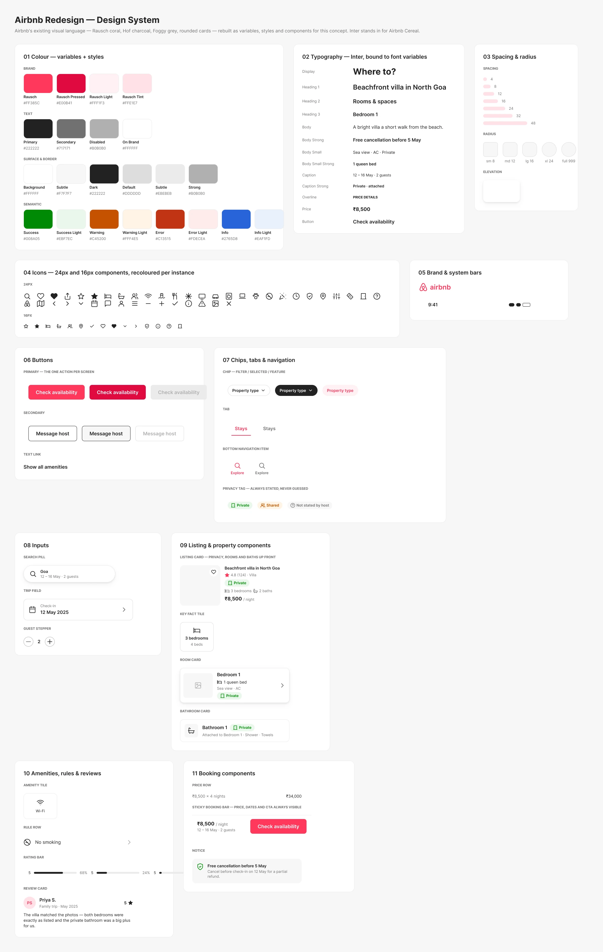
Design system
Airbnb's recognisable language, kept: white surfaces, charcoal text, coral accents, rounded cards and big photography. The aim was better hierarchy, not a new brand.
- Brand coral#FF385C
- Primary text#222222
- Secondary text#717171
- Surface#F7F7F7
Mobile UI
12 screens: the booking journey, comparing saved stays, and the edge cases. Hover a screen to see it.
Search & discover
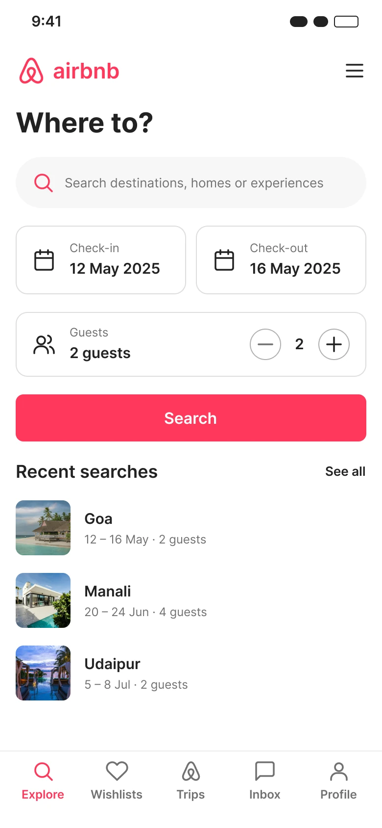
Search
Destination, dates, guests and filters to start clear.
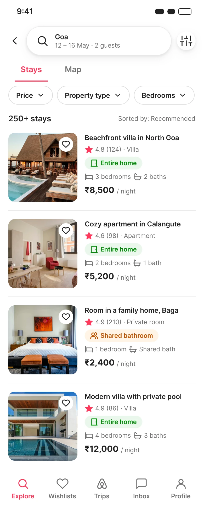
Search results
Type, beds, baths and privacy make similar stays distinct.
Understand the property
Property overview
Key facts first: home type, bedrooms, bathrooms, guests.
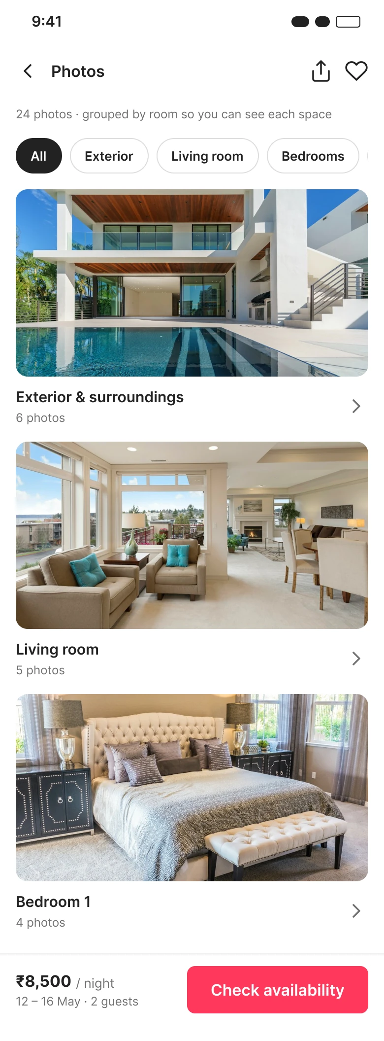
Photos by room
Every photo belongs to a labelled room or space.
Rooms & spaces
Beds, bathrooms and private vs shared, per room.
Check & book
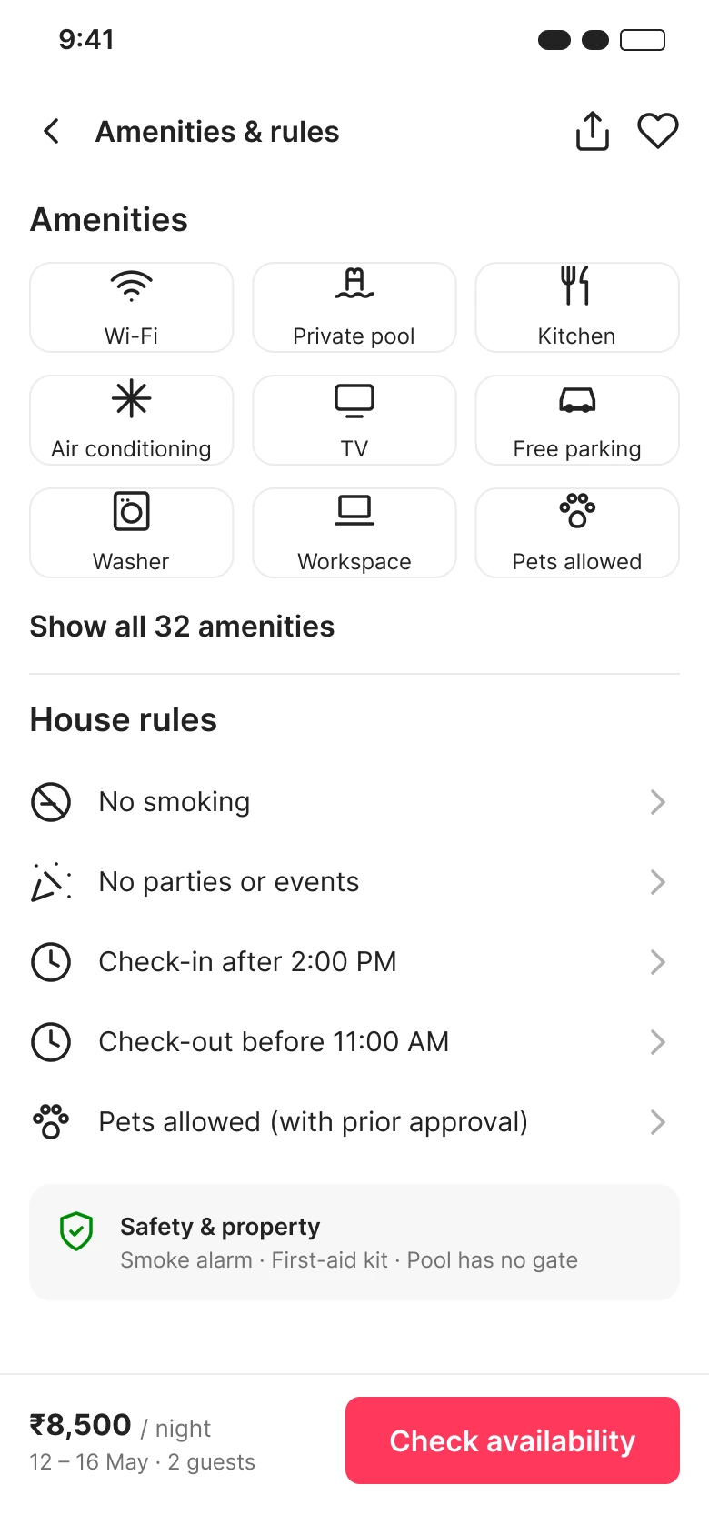
Amenities & rules
Facilities, house rules and check-in in scannable groups.
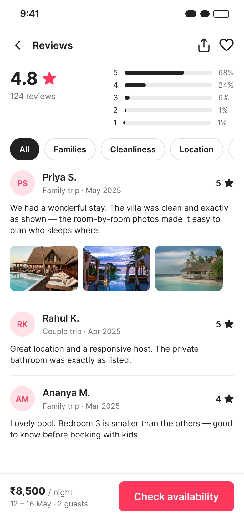
Reviews
Rating summary, filters and relevant guest feedback.
Review & book
Dates, fee breakdown, total and cancellation, all up front.
Compare saved stays
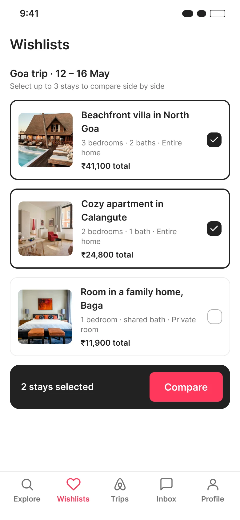
Saved stays
Shortlisted properties in one place.
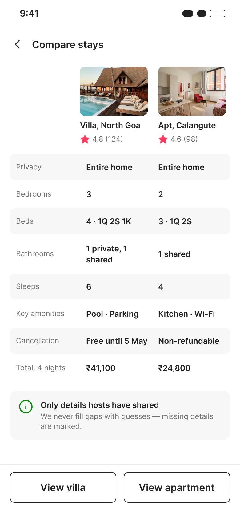
Compare stays
Rooms, privacy, amenities and total cost side by side.
Edge cases
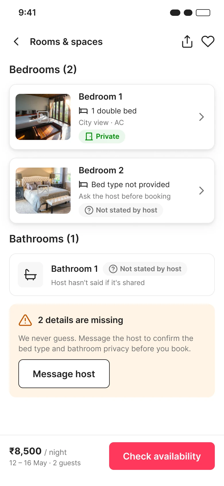
Info missing
Missing room details are stated, never guessed.
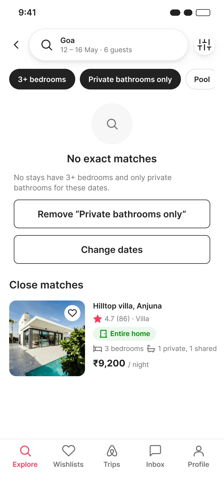
No matches
Suggestions to widen the search instead of a dead end.
Validation plan
Nothing has been tested yet. Each hypothesis gets a task and a measure, run on both the current app and the prototype.
Outcome & reflection
Travellers should understand the accommodation before they commit to booking it.
- Room-organised photos
- Structured room details
- Clear privacy
- Transparent booking
Next steps
- Dated screenshots of today's Airbnb flow, with specific observations.
- Interviews with recent travellers, including families.
- A consistent hands-on review of Booking.com, MakeMyTrip and Agoda.
- A clickable prototype and usability tests, then iterate.
The full story
Read the full case study
Every detail behind this summary: research notes, synthesis, flows, wireframes and all final screens.