Case study · Mobile app
SEVA
Government services, made easier.
A mobile-first guidance layer that helps Indian citizens discover, understand and prepare for government services, then hands them off to the official portal with confidence.
Portfolio note SEVA is a concept product. It is not affiliated with or operated by any government authority.
At a glance
The hardest part of a government-service journey isn't a missing service. It's the uncertainty: finding the right one, knowing if you qualify, what to prepare and where to apply.
- Problem
- People struggle to discover, understand and prepare for government services.
- Research
- Exploratory interviews, a hands-on audit of existing portals, and affinity synthesis.
- Insight
- The biggest friction is uncertainty across the journey, not one broken screen.
- Solution
- A need-first guidance layer that leads to relevant services and the official portal.
- Validation
- Informal review with a small set of users; direction confirmed, no invented metrics.
- Outcome
- A focused, citizen-friendly journey that reduces uncertainty before application.
Core product promise
Tell SEVA what you need. Understand your options. Prepare confidently. Continue to the official source.
The problem
People start with Google, not a government portal. Scheme names, eligibility rules and scattered portals make every step uncertain, so many lean on a younger family member or an intermediary.
Problem
- Users often start with Google rather than a government portal.
- Eligibility and document information is hard to interpret.
- Multiple portals and government terminology create navigation uncertainty.
- Some users depend on younger family members or intermediaries.
Design response
- Need-first discovery instead of scheme-first discovery.
- Plain-language explanations and progressive disclosure.
- A document checklist before application.
- A clear official-source handoff and trust messaging.
Research
Goal: understand how people discover government services, decide whether one applies to them, where they get stuck, and what they need before they feel confident enough to apply.
Approach
- Exploratory interviews and conversations with roughly 7–10 people.
- Hands-on audit of myScheme, UMANG, India.gov.in and MP Online.
- Synthesis through affinity clustering, personas and a current-state journey map.
- Decisions based on recurring patterns, not a single person's complaint.
What people do today
- Discovery
- Search Google for a scheme name or a problem, like “awas yojna”.
- Eligibility
- Google again, MP Online, or ask a local official or intermediary.
- Documents
- Search Google, because the required list is hard to locate.
- Language
- Users with weaker English ask younger family members for help.
- Applying
- OTP issues, CAPTCHA, downtime and confusing portal interfaces.
- Afterwards
- An SMS confirms it; many never return to track the application.
Findings
Affinity clustering surfaced six themes. Together they showed that the friction isn't one broken screen; it's uncertainty across the whole journey.
- 01
Discovery
“Where do I start?”
People search by goal, but government ecosystems are organised around schemes, departments and portals.
- 02
Eligibility & documents
“Do I qualify?”
Users rely on Google or other people and meet incomplete or conflicting explanations.
- 03
Language & comprehension
“What does this mean?”
Translation alone doesn't guarantee understanding. Readability and plain language matter.
- 04
Navigation
“Where do I go next?”
Multiple URLs, redirects, clutter and inconsistent pages make the ecosystem hard to navigate.
- 05
Application friction
“Why isn't this working?”
OTP issues, CAPTCHA, downtime and unclear recovery paths increase abandonment and dependency.
- 06
Human dependency
“I need someone to help me.”
Users lean on family members or intermediaries just to understand the process.
Design principle
Reduce uncertainty at every step.
Personas
The same product has to work for someone who needs guided help and for someone who already knows how to search. That's why SEVA pairs guided discovery with an independent Discover mode.
Primary persona: the assisted user
Profile
- Can use a smartphone but finds government processes difficult.
- May understand Hindi better than English.
- Often asks a younger family member for help.
- Needs confidence before taking the next step.
Needs
- Simple explanations.
- Clear eligibility guidance.
- A reliable document checklist.
- A clear path to the official portal.
- Less dependence on another person.
Secondary personas
Independent seeker
Comfortable with smartphones and search. Wants to quickly check that information is correct and trustworthy.
Family service manager
Handles services for parents or relatives. Values quick, trustworthy, shareable guidance.
Current journey
Mapping the journey before SEVA showed nine stages, with friction at almost every one.
Three critical moments
“What am I looking for?”
Discovery and terminology.
“Can I get this?”
Eligibility and confidence.
“What do I need?”
Documents and preparation.
Experience audit
A hands-on audit of four existing experiences, focused on what I observed while using them. The aim was to find opportunities for SEVA, not to rank government platforms.
Opportunity
Don't replace the portals. Make the journey understandable before people reach them.
Product strategy
SEVA is a citizen-friendly guidance layer, not another government portal. It helps people discover, understand and prepare; the official website stays the source for applying.
Core product model
- Need
- Context
- Relevant services
- Understand
- Prepare
- Official source
- My Seva
Trust principles
- Clearly label official sources.
- Never pretend SEVA itself is the government.
- Say “may be relevant” rather than making definitive eligibility claims.
- Show published criteria, and explain that the authority decides final eligibility.
- Tell users when they're leaving SEVA for the official portal.
Architecture & MVP
Three tabs keep the app simple: Home, Discover and My Seva. The MVP covers everything up to the official handoff, and deliberately nothing beyond it.
Primary navigation
Home
Search or describe a need · Popular needs · Continue where you left off.
Discover
Search · Browse categories · Popular services.
My Seva
Saved services · Recent activity · Official links.
MVP scope
Must have
- Need-based discovery and search
- Guided questions
- Service recommendations
- Simple service explanations
- Eligibility guidance
- Document checklist
- Language selection
- Official source verification and handoff
- My Seva
Later
- Application tracking enhancements
- Reminders
- Family sharing
- Voice assistance
- Document storage
Core flow
One primary scenario drove the flow. Each step answers a single question before moving on.
Primary scenario
“I need housing assistance, but I don't know which government scheme is right for me.”
Wireframes
Low-fidelity work focused on structure, not decoration: short goal-oriented questions, scannable selection cards, and progress indicators to reduce uncertainty.
Cut and merged in review
- Removed a separate Confirm screen; users had just answered the same questions.
- Removed a standalone eligibility-loading screen; it added no meaningful decision.
- Merged “How to apply” into Service Details.
- Turned the “Information saved” page into a lightweight toast.
Approved journey
- Home
- Discover
- Need
- State
- Housing situation
- Income
- Relevant services
- Service details
- Documents
- Official handoff
- My Seva
Visual design
Designed to feel more approachable than a traditional government portal, while staying trustworthy and accessible.
- Primary#2563EB
- Navy text#172033
- Background#F8FAFC
- Surface#FFFFFF
- Border#E2E8F0
- Success#15803D
- Warning#B45309
- Accent teal#0F766E
Type & components
- Inter throughout. H1 32/40 bold, H2 24/32 bold, body 15–16px.
- Cards with a 12–16px radius, white surface and a subtle border.
- Primary CTA in #2563EB, around 48px tall, with strong contrast.
- Selected states use light blue plus a clear border, never colour alone.
- Semantic colours are reserved for success, warning and error, never for final eligibility decisions.
Final screens
High-fidelity UI for the complete housing-assistance journey.
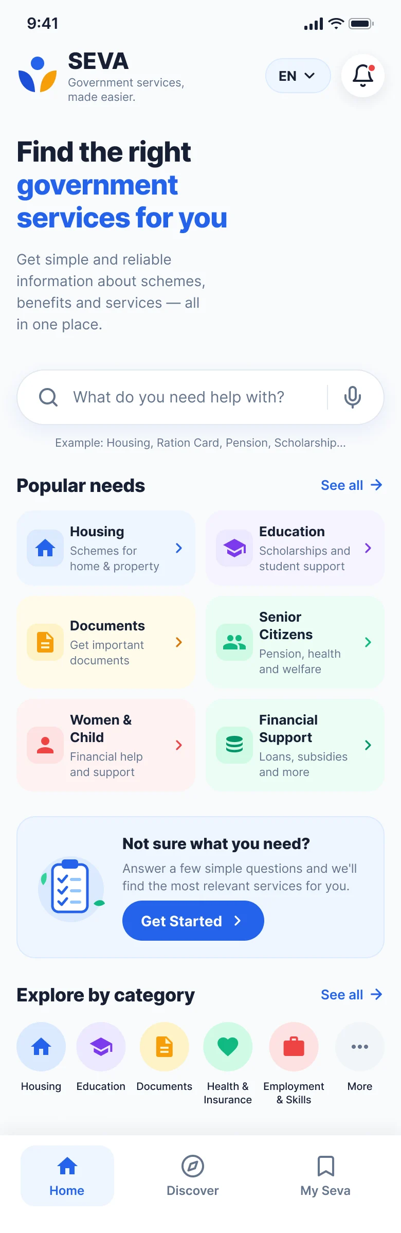
Home
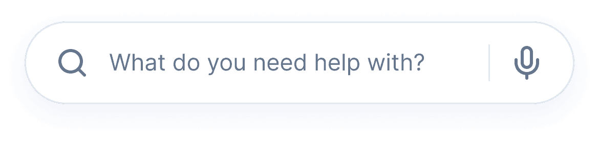
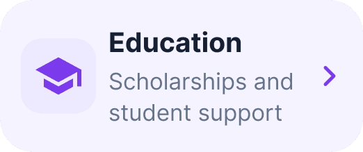
Start with a need: search in everyday language, browse popular needs, or ask for guided help.
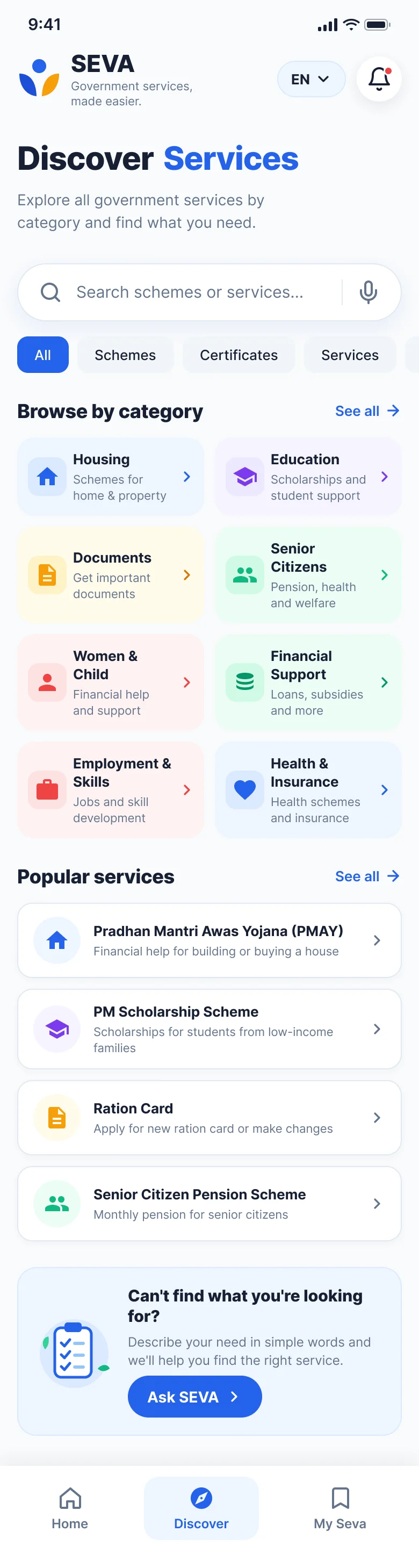
Discover
An independent path for people who'd rather browse categories than answer questions.
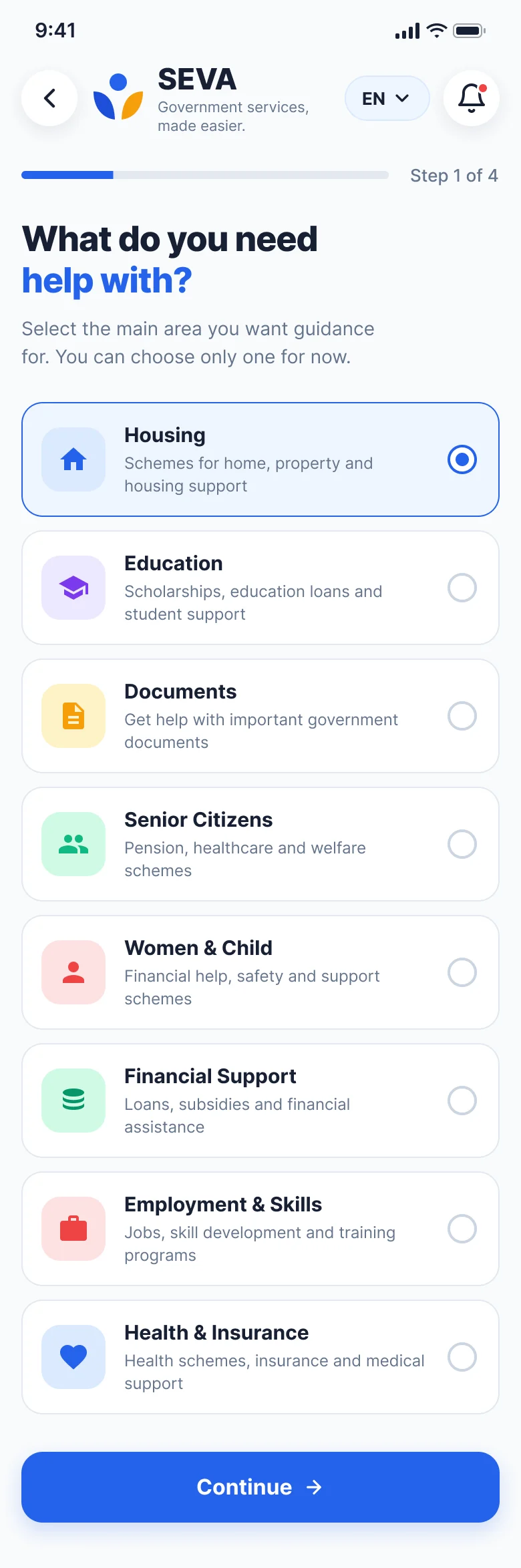
Need selection
Asks what you need, not which scheme, because people search by problem.
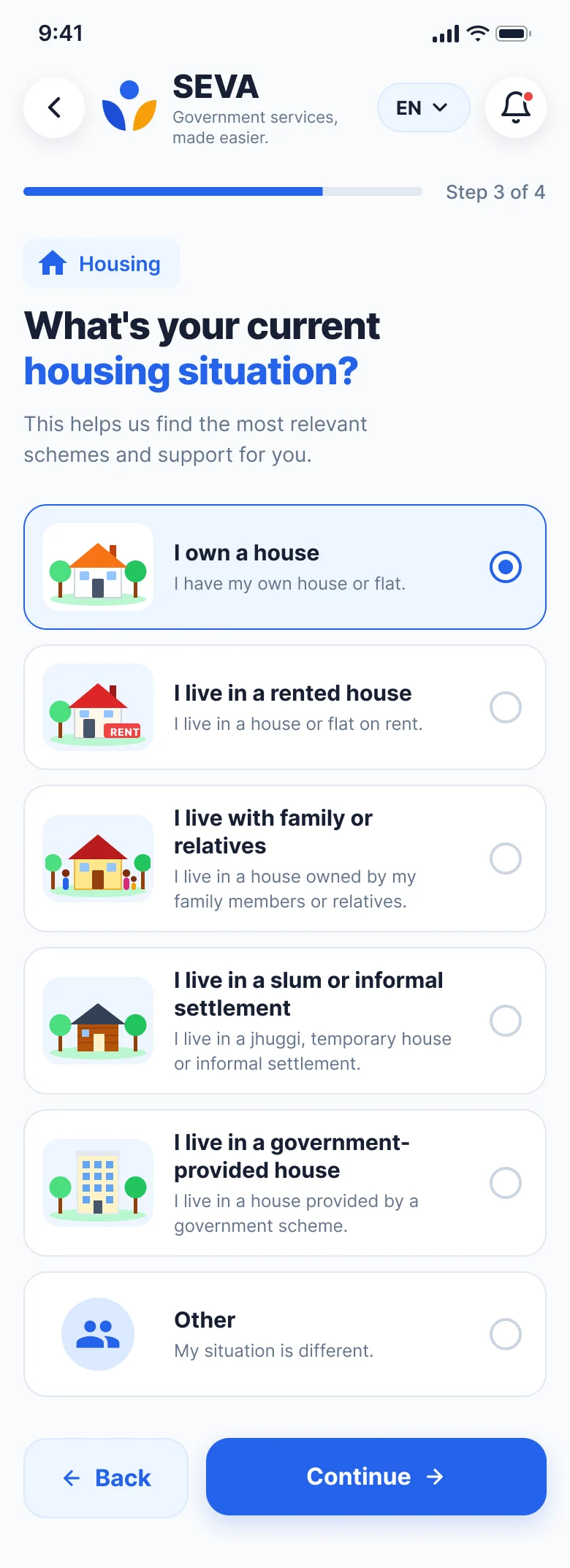
Housing situation
Simple context questions, only where they change which services fit.
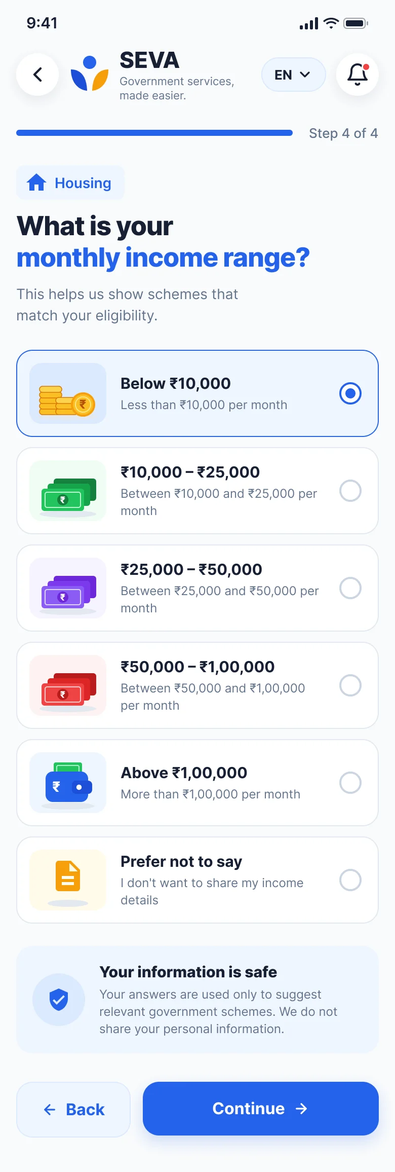
Income
A broad range instead of an exact figure, with a note on why it's asked.
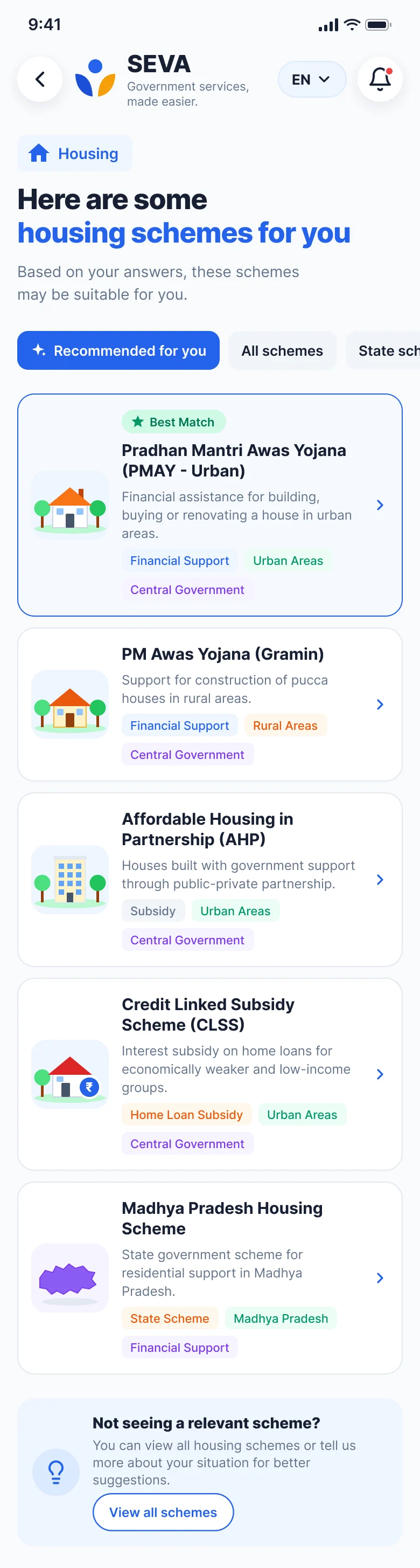
Relevant services
Framed as “may be relevant”, never as a final eligibility decision.

Service details
Benefits, eligibility, documents and how to apply, all in one view.
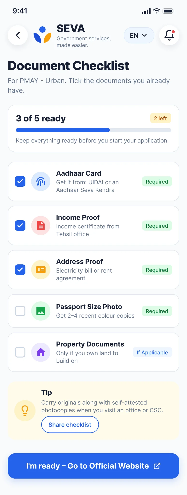
Document checklist
Know exactly what to prepare before leaving SEVA.
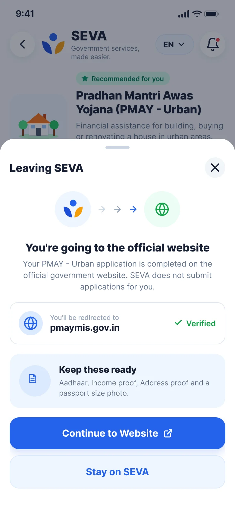
Official handoff
A trust checkpoint that makes the boundary with the official portal explicit.
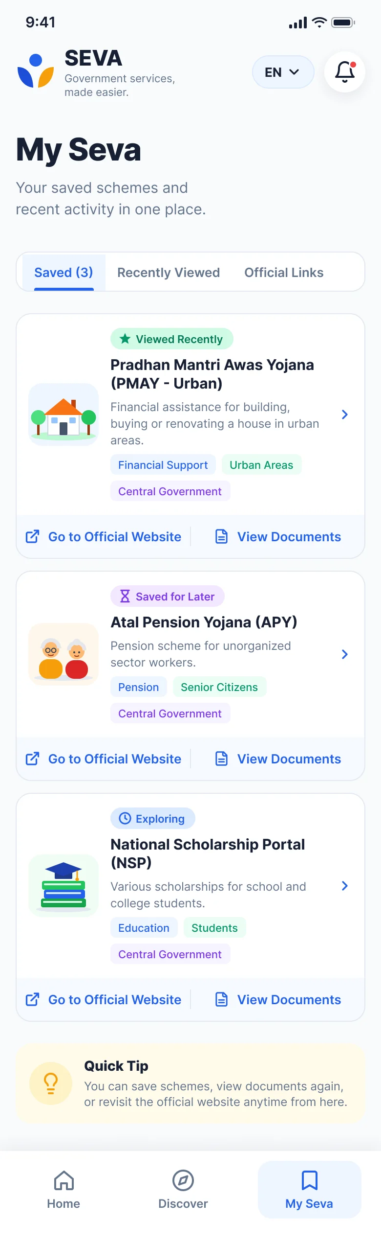
My Seva
Saved and recent services, with official links and documents close at hand.
Validation
The core flow and high-fidelity direction were reviewed with a small group of users. The review confirmed that the concept and flow were understandable and aligned with the original problem.
What was validated
- Need-first is easier than asking users to know a scheme name.
- The guided questions feel connected to the user's goal.
- Results need cautious language like “may be relevant”.
- Document preparation deserves its own screen.
- The official-website handoff is important for trust.
What changed
- Removed the standalone confirmation screen.
- Removed the standalone eligibility-loading screen.
- Merged “How to apply” into Service Details.
- Made “Information saved” lightweight feedback, not a page.
- Kept Discover separate so both exploration styles remain.
Outcome
A fragmented discovery journey became a guided, understandable path. SEVA doesn't try to fix the whole ecosystem; it focuses on the highest-value moments before application.
Before
- Search Google.
- Interpret scheme names.
- Search eligibility separately.
- Search documents separately.
- Navigate unfamiliar portals.
- Depend on others for clarity.
With SEVA
- Start with your need.
- Answer a few contextual questions.
- See potentially relevant services.
- Understand the service in one place.
- Prepare documents before applying.
- Continue to the official source with confidence.
Core UX outcome
SEVA reduces uncertainty before the user reaches the official application journey.
What to measure next
- Task completion rate for finding a relevant service.
- Time to identify a potentially relevant service.
- Confidence before clicking through to the official website.
- Document-readiness comprehension.
- Drop-off at each guided question.
- Return usage of My Seva.
Reflection
The most important lesson from SEVA was that the problem wasn't simply “government websites have poor UI”. The deeper issue was uncertainty: people were unsure what to search for, whether information applied to them, what to prepare and where to go next.
That changed the direction. Instead of rebuilding a government portal, I designed a guidance layer that translates citizen intent into a clearer path, while preserving the authority of the official source.
What I'd explore next
- Voice-based need discovery for people who struggle with typing or terminology.
- Family sharing for people who help parents or relatives.
- More robust official-source verification and update workflows.
- Accessibility testing with older users and users with low digital confidence.
- A larger usability study with measurable task-success and confidence metrics.
The full story
Read the full case study
Every detail behind this summary: research notes, synthesis, flows, wireframes and all final screens.